Amazing redesigns by Shepard Fairey
Words/Pictures+Entertainment=$ (?)
Finally!
New York Magazine ran and article about the acceptance of graphic storytelling. Highlighting two writers Brian Selznick, author of The Invention of Hugo Cabret, and Jeff Kinney, creator of the “Diary of a Wimpy Kid” series. The article goes on to say, "They have have seized on the shift in young people’s reading expectations to make enormous hits out of books that mix comics and literature in clever ways. The yearlong residence of Hugo Cabret and the “Wimpy Kid” books near the top of the Times chapter-book best-seller list—typically populated by the usual suspects of young-adult best-sellerdom, like fantasy epics and li’l-chick lit—represents the first wave of a potential revolution in the YA market: the incursion of comics into “respectable” children’s fiction."
http://nymag.com/arts/books/reviews/45981/
Like this a new thing? Comics have been around for years as well as graphic novels. So why now? Why now are they finally falling into the mainstream. Timing? Acceptance? Money?
I for one welcome the "change" and hope it pushes writers and illustrators to see the medium in a new way to produce new stories that will entertain us.
Entertain us? Is that really why these books are becoming more popular. Are they just more upfront out being entertaining? Is a book with 400 pages with 200 illustrations more entertaining than a book with just 400 pages of text? On the surface yes. I believe the success of the "Wimpy Kid" books beyond that it is a great story and funny as hell is that when kids or even adults look at it they don't see "work". They see a book that is entertaining. An this is solely due to its format. Mixing pictures and words to ease the reader along. To hide any "work" they might be doing in the actual reading in the pleasure and entertainment of the illustrations. Thus hooking the sought after reluctant reader. Sounds pretty easy right? Not at all. Like anything else you need a good idea and you need to execute that idea well. Just combining Words and Pictures in a new way just to be where the trend is won't work and it will result in mediocre works. I just hope that publishers don't go to the route of the cut off face/body part novel jacket. It seemed cool at the time but now that everyone is doing it things begin to look the same.
To clarify . . . do I want to see more books like The Invention of Hugo Cabret or The Wimpy Kid books, Yes! But I would hope not to see clones of these ideas rather the ideas that build on these ideas taking this "new" medium further.
Planning for the worst
I had the honor of talking about my profession to a group of about 30 Pratt University students today. I talked about how I got my start in publishing, graduating RISD as a illustrations major, (Illustration got some cheers. RISD got some boos.) as well as the process of making a picture book. All along trying my hardest to give as much real world advice as possible no matter how scary it might have seemed to them. I am sure I would have scared the crap out of myself at that age. The truth is a scary thing when you feel unprepared to hear it. How did my work fit in, I remember thinking? As I sure everyone does at that time. I tried to keep that in mind when talking with them. Trying to think what are other routes that you can take your work to make money so not to limit yourself. I went around the room and gave a brief crit of there work. which gets harder as you go around the room. I kept thinking I don't want to repeat myself and this person deserves to hear something new from me. I managed to mumble out some gems. Most had the same issues color, direction of there work and overall voice. Common issues that we all struggle with even after school. (well maybe not color ) Before each crit I asked the same question. The hardest question you can ask a senior with only weeks left of school. "What do you want to do?" I couldn't have answered it at that time but I knew what I liked. And if you follow that you will find what you want. I had no idea that I would be in children's books let alone and art director of them. In fact I didn't like kids books at all. Mainly because I didn't fit into them or so I thought. Perhaps that is why I have done well in the field. All in all I saw some promising work in the room but I left feeling a touch of anxiety in my chest. I was feeling the stress of the room I think. In no uncertain terms there futures are before them. Not knowing where they are going. It's tough to let go and dive into the abyss and hope for the best. My parting advice is we must plan for the worst so good things happen. If the bad shall occur we are prepare to deal with it rather than letting it consume us, keeping us from moving forward.
That being said, my next portfolio review is at RISD, April 23rd. I am interested to see what they will be bringing.
I'm giving a talk and . . . people are going to listen?
Thursday, March 6, 2008, 6:30-8:30pm
Location: GRAPHIC ARTISTS GUILD (www.gag.org)
32 Broadway, Ste. 1114 on the 11th Floor
MTA: #1,#2,#3,#4, #5, #9 to Bowling Green
TOPICS WILL INCLUDE: HNA happenings, the structure of HNA children's books, HNA submission procedures, HNA expectations from the submitting artist and/or writer, and the children's book industry in general. Agenda will provide one hour for guest speaker, limited question and answer, and allowance for three portfolio and/or dummy book critiques—selected by lottery—with constructive criticism of about 15 minutes per piece from the guest speaker
The Evolution of a Wimpy Kid Cover-Part One
First of all, let me get something straight: This is a JOURNAL, not a diary. I know what it says on the cover, but when Mom went out to buy this thing I SPECIFICALLY told her to get one that didn't say "diary" on it. Great, All I need is for some jerk to catch me carrying this book around and get the wrong idea.
These are the opening lines to Diary of a Wimpy Kid and the foundation of the cover concept.
When I started work on Wimpy Kid, Jeff's dream of taking his online comic into print had become a reality and it was my job to make sure my design lived up to this dream.
At first glance this project seemed to be easy. I wouldn't have to find an illustrator, I already had one and a concept was already in the works. All things that might lend themselves to solving the cover problem quick.
Not so.
What I didn't realize was that the passage above does a lot more than open up the book it directs what the cover should look like almost literally. This initially caused some trouble. Only because it limits what can be done, I felt trapped in away.
Here are some of the problems I faced.
1. Greg states that even though the book says diary on it it is a diary at all.
a) If it's not a diary how do we show this idea?
b) How do we make it look like a diary and make it pop? In other words make someone pick it up.
2. Who would write "of a Wimpy Kid." Most likely written by Rodrick Greg's brother. So How do we put this on the diary surface being that the diary was bought by Greg's mom?
3. What surface will the Illustration of Greg be drawn on. Remeber that since everything has a reason in reality for being there so does does this element and must be treated as such.
4. How to do all this an make the cover iconic.
Images:
Top photo shows the two journals and materials that were used in making the 'Diary'.
Image on the right depicts the first two comps made for the cover.
The black version is the first comp made for the cover by Jeff Kinney in the very early stages of the book way before it was bought by Amulet Books.
The red version ( color palette taken from The Catcher and the Rye) is my first initial stab at the cover. Both have elements of what the cover would become but both are a far cry from what they would evolve into. I used the word evolve since the cover and my relationship with Jeff did just that evolve grow and form into something new.
Part two:
http://cwdesigner.blogspot.com/2008/01/evolution-of-wimpy-kid-cover-part-two.html
ev·o·lu·tion –noun
1. | any process of formation or growth; development: the evolution of a language; the evolution of the airplane. |
Special Effects
Ever wonder how does the designer tell the printer what effect he or she wants on a jacket?
Well I'll tell ya. Here is an example of the print out made for Diary of A Wimpy Kid: Rodrick Rules by Jeff Kinney.
Early on in designing the first book we had decided that we wanted it to look like a journal. Okay but how do you get it to feel like one? I wanted the jacket to have a found object feel. As If Greg Heffley had drawn and pasted the objects on to the cover himself. To enhance this idea we used a Spot UV coating on the tape to give it a tape like feel in contrast to the matte surface of the cover. Over all the effects are fairly common but used in a way that enhances the concept of the book rather than just adding an aesthetic appeal. I think we managed both in this case.
Here in this example you can see how I marked the print out up to tell the printer exactly what I wanted.
Complicated Simple
"Anyone can make the simple complicated. Creativity is making the complicated simple"
—Charles Mingus
—Charles Mingus
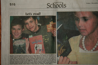
Let's read!
Here is the best thing that happened to me over the Christmas Break. In my home town paper
The New Milford Spectrum) I saw this picture; Two boys holding two different books ( Diary of a Wimpy Kid and The Last Apprentice: Revenge of the Witch ) both designed by me.
For the most part my family really doesn't get what I do so to have this as a piece of evidence of my profession is deeply satisfying even if they still think I drew the pictures. Oh me.
I have begun to collect all my files from the development of the Diary of a Wimpy Kid cover.
I hope to explain the development of the cover design, process and concept that it went through. To explain the process in full from the author's point of view I am enlisting Jeff Kinney to give his take. ( As soon as he finishes book 3) It should be interesting and I am excited to get started on it.
100 ideas
12.20.07 Playlist
Currently Listening To:
Marquee Moon—Television,
Black Country Rock—David Bowie,
Let's Get Funky—Hound Dog Taylor and the
Houserockers,
Gentle on my Mind—Johnny Cash,
Girl Of My Dreams—Charles Mingus
Samskeyti—Sigur Ros,
Cloud Cult—Chemicals Collide,
House of Cards—Radiohead,
Come As You Are—Nirvana,
Glass, Concrete and Stone—David Bryne,
Big Rock Candy Mountain—Tom Waits,
In Transit—Albert Hammond, Jr.,
One Thought Is Flickering—Die Romanik,
Friends—Chris Holmes,
I Don't Really Love You Anymore—The Magnetic Fields,
A Prayer For England—Massive Attack,
These Days—Mates of State,
Things To Try—Terry Reid,
The Great Escape— We Are Scientists,
Daisy—Chuck Coleman,
Rise—Eddie Veder,
Plans—Grizzly Bear,
In the City—The Jam,
Radio, Radio—Elvis Costello,
So It Goes—Nick Lowe,
The Blues Are Still Blue—Belle & Sebastian,
Jesus, etc.—Wilco,
Where To Begin—My Morning Jacket
Lloyd, I'm Ready To Be Heartbroken— Camera Obscura,
New York, New York— Ryan Adams,
Prelude To A Kiss—Phineas Newborn Jr.,
M.I.A.— Foo Fighters,
Good Vibrations—Brian Wilson,
Cars and Telephones—The Arcade Fire,
Thank You For Sending Me An Angel—Talking Heads
Postcards from Italy—Beirut,
London Calling— The Clash
No More Heroes—The Stranglers
Al Roker’s next Today Show book club pick
Book 1: The Fairy Tale Detectives
will be Al Roker’s next Today Show book club pick
this Friday December 21 at 9:30am est. This is an amazing media hit and a terrific follow-up to the reappearance of the series on the New York Times bestseller list in October.
You can see previous club picks and the types of online resources that will be made available by visiting this link:
http://today.msnbc.msn.coPublish Postm/id/18179145/
Book 1 will be the focus of the club pick, the just-released book 5 will get a plug, and all of the other books in the series will be shown on the set.
Pictures and Words
The Best Thing Ever— Wimpy Kid Beats out Billy'O
A New Way of Seeing—Samuel Palmer
There are some artist who give us a new way of seeing: Samuel Palmer is one of them. He painted familiar scenes—trees, sheep, villages, the night sky, fields, —but in a way that had never been done before, before Palmer. Subsequently, his rich forms and vivid colors have inspired many artist including myself.
Seurat at the MoMa
Though Seurat is most often remembered as a Neo-Impressionist, the inventor of pointillism, and the creator of the painting,
A Sunday on La Grande Jatte, his incomparable drawings are among his–and modernism’s–greatest achievements. Working primarily with conté crayon on paper, Seurat explored the Parisian metropolis and its environs, abstracted figures, spaces, and structures, and dramatized the relationship between light and shadow, creating a distinct body
of work that is a touchstone for the art of the twentieth century and today.
Even though Seurat saw his drawings as only a means to an end, research for his painting. I find them even more poetic than his actual paintings. Transient. His figures dissolve into the landscapes becoming part of there surroundings.
So quiet yet charged with the vibrations of there presence.
The drawing, most of them made in his studio, focus on light and its shaping and modeling of the figures. The resulting tones informed color relationships in the final work.
If you haven't gotten yourself down to the MOMA you need to. I am planning to go back for seconds. And if your're there say hi to Andrew Wyeth's Christina's World she is lonely.
A Sunday on La Grande Jatte, his incomparable drawings are among his–and modernism’s–greatest achievements. Working primarily with conté crayon on paper, Seurat explored the Parisian metropolis and its environs, abstracted figures, spaces, and structures, and dramatized the relationship between light and shadow, creating a distinct body
of work that is a touchstone for the art of the twentieth century and today.
Even though Seurat saw his drawings as only a means to an end, research for his painting. I find them even more poetic than his actual paintings. Transient. His figures dissolve into the landscapes becoming part of there surroundings.
So quiet yet charged with the vibrations of there presence.
The drawing, most of them made in his studio, focus on light and its shaping and modeling of the figures. The resulting tones informed color relationships in the final work.
If you haven't gotten yourself down to the MOMA you need to. I am planning to go back for seconds. And if your're there say hi to Andrew Wyeth's Christina's World she is lonely.
A Evening with the De Brunhoff's
I am currently working on Laurent de Brunhoff's next installment of Babar and family's adventures, BABAR'S USA.
Babar and his family travel to the U.S. in this new Babar adventure. Among
the places they visit: NYC, Key West, Los Angeles (Hollywood), San
Francisco, Grand Canyon, and Vermont (skiing).
Laurent has created a new medium for the images: he places the drawn
characters of Babar and his family into photographs of the actual places. A
very humorous and appealing approach!
Phyllis Rose de Brunhoff used her keen wit to spin an incredible text to accompany the images.
She also gave me some great recipes. ( That I actually used)
We sat down over a glass of scotch and went over layout in his Upper East side apartment. It was a surreal moment to be working on a Babar book. When not too long ago I was being read one and not over a glass of scotch. Who was I too be telling him what I thought, right! Well I guess that's what I do now. Kinda amazing.
Phyllis Rose de Brunhoff used her keen eye to look over the text and gave me some great recipes. ( That I actually used)
I 'll post pics of the art when the book gets closer to being done.
Advisement: Babar reminds his readers that this a work of fantasy, and only elephants should try to place their young on the backs of buffalo.
Frannie in Pieces to appear on CBS Sunday Morning
Sample Pages for Something to Blog About
Something to Blog About is divided into two sections. The first, Libby Fawcett's Blog entries. Second, the rest of the story. I tried my best to make the blog pages act like a real Blog page. Complete with Blog entries, scroll bars, and Blog header. Christine Norrie ( illustrator of the amazing jacket art ) drew those sweet characters on the title page.
When ever I am designing an interior I try to keep in mind the reluctant reader (me). I want to have an enjoyable visual experience when I am reading. Almost like a reward for reading. Adding this visual experience adds to the experience of the reader and reading itself. An ambitious goal I know, but it's what I strive to accomplish in my work. Something to Blog About I think is a good example of this idea.
instinct and intuition
"After reading half of this book sometime ago and then getting side track, I finally picked it up again. Mainly to get reacquainted with Dylan before seeing I'M NOT HERE.
I am currently reading the chapter where Dylan is lost with in himself. No longer enjoying is creativity or understanding it. "The problem was that after relying so long on instinct and intuition, both these ladies had turned into vultures and were sucking me dry" Dylan said. He was stuck unable to change and didn't know why or how to get back. But you can't resist change it will only pull you under. Feeling this pull he leaves a rehearsal with the Dead intending not to go back because he felt he had nothing to give. Until he goes for a walk in the rain, passing a small forgotten jazz club. He describes being "called" into the bar. After listening to an old jazz singer belt out lyrics with his natural force and relaxed attitude. Inspire or reminded of himself he begins to find his old confidence. To create from your instinct to let yourself flow with out your mind getting in the way. Almost and automatic reaction. Not resisting your natural forces. I think Dylan saw this was aware this simple notion that is easily forgotten.
His awareness of the moment struck me the most. To be opened to listen to the signs or callings around him. To not resist the pull. To be aware that signs or feelings might help or figure into helping him along. When we resist these we resist learning. Learning about what's next. Resisting change. And if we do we are forever stuck.
Okay on to the next chapter