Vegetables in Underwear steps out

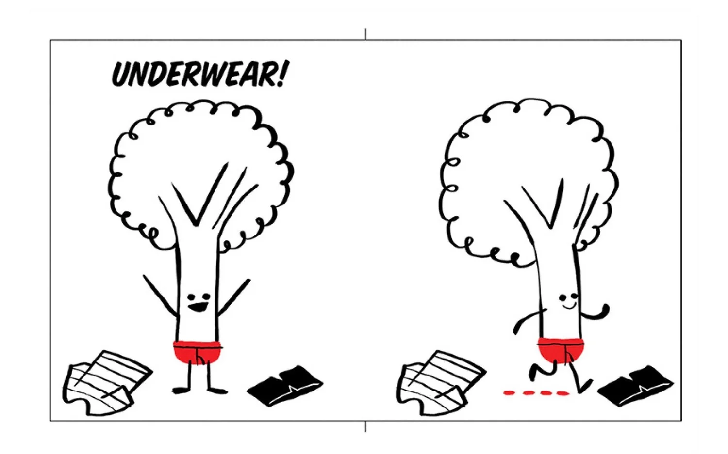
Every morning has its rituals. Scrolling through INSTRAGRAM is one of mine. On a spring morning a year or so ago I was scrolling through the daily photos with Rachel Poloski before starting the day. She was following Jared Chapman and came across the image below. I had known of his work previously but had not been following him on Instagram until the day I saw a broccoli awkwardly placing on his red underwear.

I mean come on! Amazing right? Psst . . . the answer is YES! 

I am always asked where do you find illustrators? I usually will say artist reps, society of Illustrators annuals, postcards and good old fashion research but now I can say Instagram. It's and amazing resource as an artist and art director. I love seeing artists process and finals. Not to mention the amazing access I have to see your work without having to do that much beside clicking follow. 

I immediately started showing the image around the office and started working on a  book concept.  How to turn this one hilariously weird image into a book was the task in front of us. After several hilarious fully clothed conversations with Jared we had something. Below is Jared sketches and then final layouts for VEGETABLES in UNDERWEAR

Sketch Draft

Sketch Draft

ABOVE: First color character sketch.

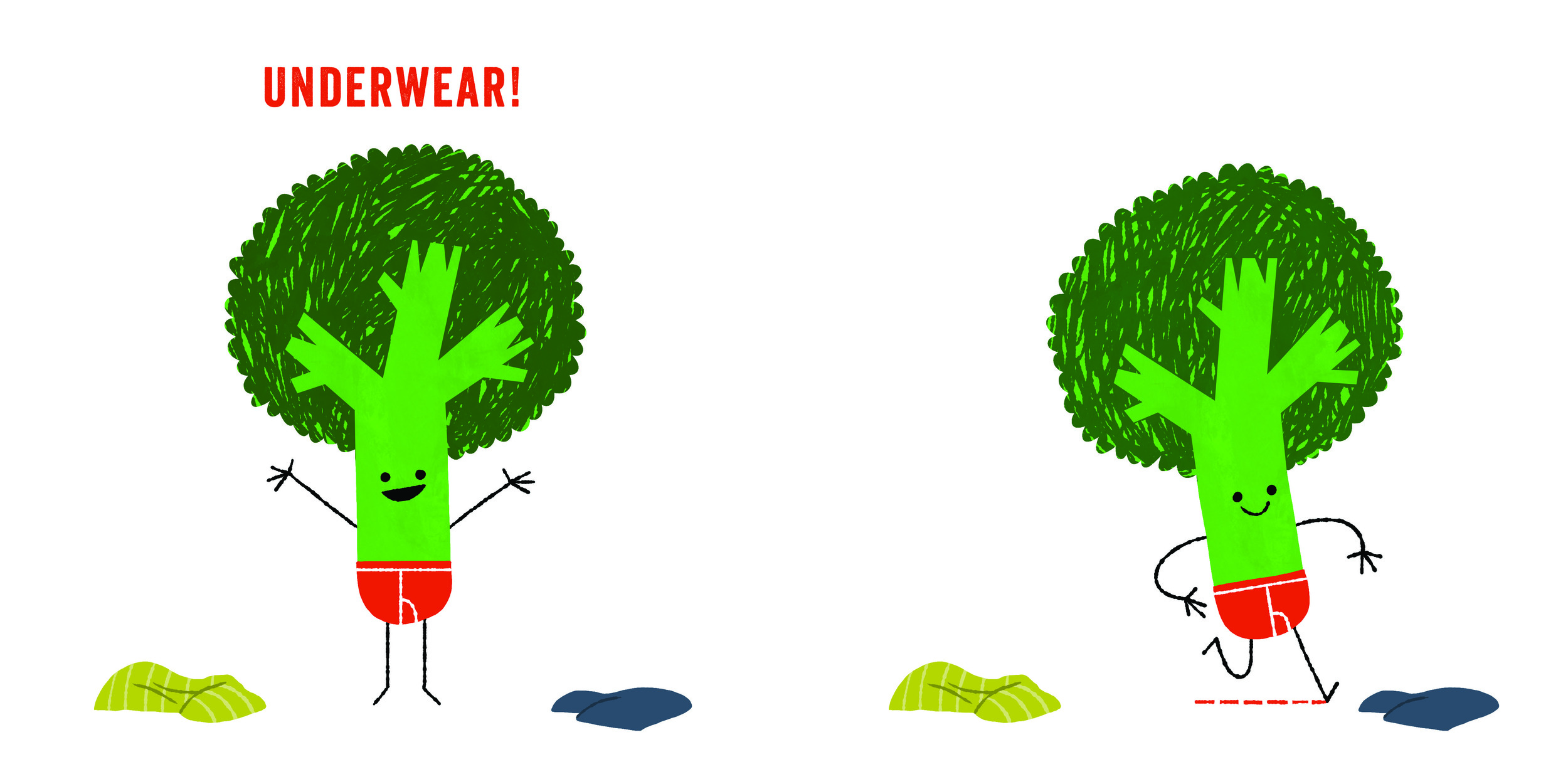
As you can see Broccoli is much different that in the sketch. We all agreed  he didn't look right. 

Final character and design layout

Final character and design layout

CWB: Hi Jared!

JC: Howdy!

CWB: This is the part of the blog where you tell us a little about what it was like to work on Vegetables in Underwear. Are you ready!?

JC: Yes, here is my big takeaway from working on this book (Which I've continued to use since):

My agent (Rebecca Sherman, Writers House) and I brainstormed ideas for the book and, once we had a general direction that we liked, I started putting pencil to paper. In the past I tended to work at a slower pace but in all of the excitement of the moment, I decided to try a different approach and work as fast as I possibly could. In hindsight, it paid off in two ways:
1. It kept the pacing and the energy of the story lively.
2. It didn't give me time to sit around and over complicate things.

We revised the dummy a couple of times and once we felt it was in good shape, we sent it over to Chad and Cecily. The quick pace carried over into production and the book- from manuscript edits to final art- was finished in a matter of weeks.

We finished the MS and interior art in a couple of months, right?

CWB: I think so. You where so fast and excited. Much like Pea.

JC: It seemed like it, but I couldn't remember exactly.
I'm usually very critical of my stuff, but this book is just silly and fun. From start to finish it was so much fun to work on. I think part of that was because of the silliness of the book but a larger part was because of you and Cecily. The two of you made the whole process exciting and enjoyable.

CWB: One last question, who is your favorite Veggie character? Mine is Pea. That kid is so much fun and perhaps should lay off the caffeine.

JC: Sheesh! Hard question. Probably broccoli just because I feel like I know him better since I've illustrated and animated him the most. But pea is a very, very, VERY close second because, how can you not love that guy, right?

First Color Sketch

ABOVE: The first color sketch of radish. We loved all the great color Jared worked up but I felt that there was too much color. I wanted to try and limit the color to only the Vegetables and the type. My hope was that we could use color to directly link the illustration and type.


Better! But now all the underwear is too boring. GUH!

More exciting for sure, but by having the underwear more detailed they started to look like pants and really lost what I loved about the simple underwear design that was in the first INSTAGRAM image I saw.

IT'S A POTTY TRAINING book with out a potty! Underwear EMPOWERMENT!

ABOVE: Rough layout sketch

So we simplified the underwear down to color. A line at the top is for girls and the flap line down the middle is for boys.

ABOVE: Final design

ABOVE: Front endpaper design. Wait! All our vegetable friends are sad? What will make them happy?

ABOVE: Back endpaper design. Phew! They love wearing just there underwear. Well except Potato and Pea. Oh Pea!

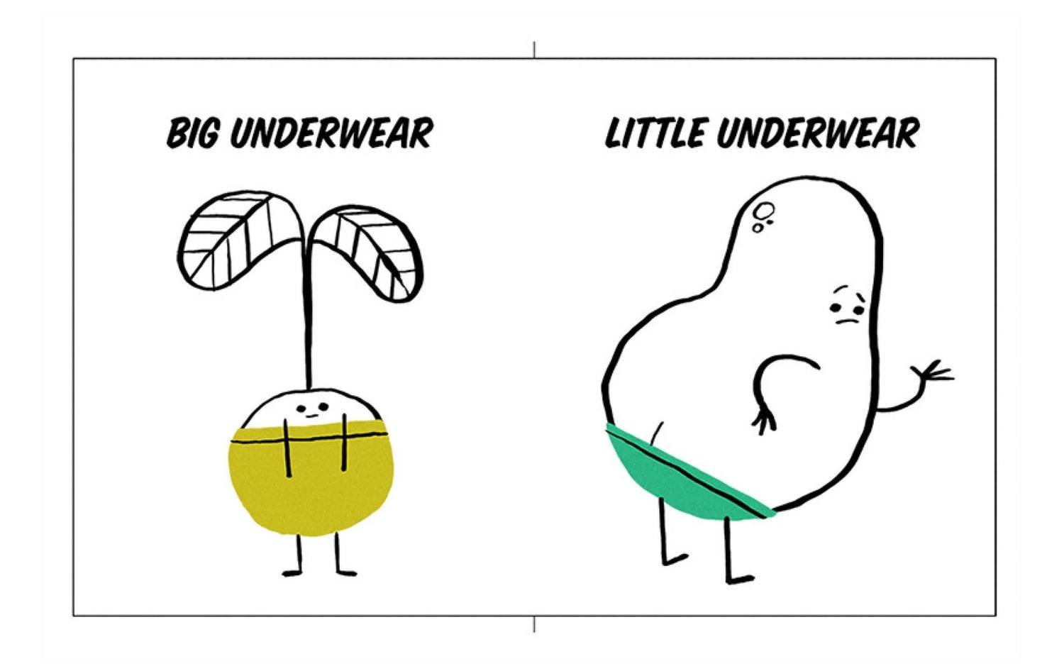
So what is Vegetables in Underwear about? Well, I’ll tell ya . . .a bunch of friendly vegetables wear colorful underwear of all varieties—big, small, clean, dirty, serious, and funny—demonstrating for young ones the silliness and necessity of this item of clothing. The unexpectedness of vegetables in their unmentionables is enough to draw giggles, but the pride with which the “big kid” attire is flaunted in front of the baby carrots in diapers will tickle readers of all ages. With rhyming text that begs to be chanted aloud and art that looks good enough to eat, this vibrant story will encourage preschoolers to celebrate having left those diapers behind!

LINK to Book Page: VEGETABLES in UNDERWEAR

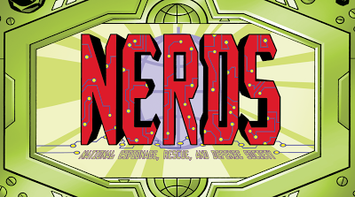
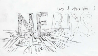
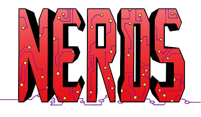
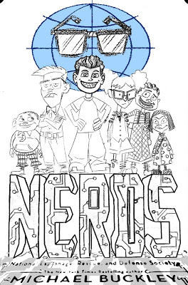
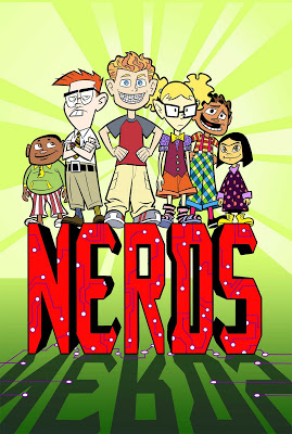
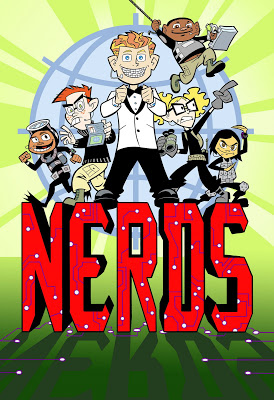
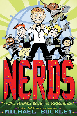
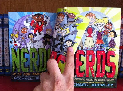
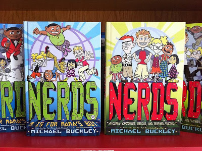
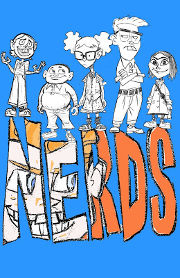
The Evolution of a NERDS book cover


"I imagine people will be surprised at how much work goes into this type of project. I'm surprised, and I participated in it!" —Ethen Beavers

The following shows the process Ethen and I went through working on the cover for Michael Buckley's latest series, NERDS. I wish I could have better descriptions but I don't want to give away all my secrets.

Step one find an Illustrator.
To find the perfect illustrator I teamed up with Michael and headed down to our local comic store, Rocketship  (sadly, now closed) on a cold January afternoon. We shifted through comics and graphic novels , compiling a list of ten names that we would present to our editor Susan Van Metre. In the end Ethen Beavers was the nerd for us. I tracked Ethen down by leaving a message on his art message board since all other searches came up flat. He responded which was a welcomed surprise.

I then sent him Michael's 2nd draft manuscript and a brief summary.

NERDS book description:
A secret spy ring of nerdy elementary school misfits
Combining all the excitement of international espionage and all the awkwardness of elementary school, NERDS, featuring a group of unpopular students who run a spy network from inside their school, hits the mark. With the help of cutting-edge science, their nerdy qualities are enhanced and transformed into incredible abilities! They battle the Hyena, a former junior beauty pageant contestant turned assassin, and an array of James Bond–style villains, each with an evil plan more diabolical and more ridiculous than the last.


Step two begin sketch phase

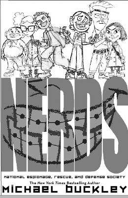
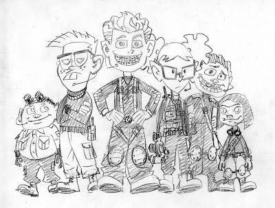
Ethen's first sketch


My first alternate compositional sketch. The idea was to introduce the all the characters.


Here the idea is the same but a little more realized. We added braces in the type. I add to a nerdy style as well as to highlight the main characters nerdy quality. This would be repeated through out the series. Only
there was something still not quite working.


We where forgetting the Spy angle to the NERDS story.
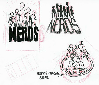
here are some additional sketches working out new compositions


The idea of and official seal came up.
Finally a font was chosen


Here we begin to work out color and how it will be used throughout a 6 book series


Next how to treat the type. I wanted a techie feel to the type as seen below.


Final type

But the seal still is working correctly. So we tried to nerd that up as well.
In the end it proved to be to much.


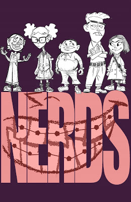
At last the color and composition is worked out.
Only something is still not working.


Again we needed more spy imagery. So we research James Bond and Mission Impossible imagery.
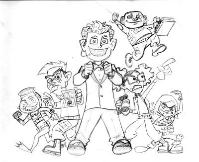
Ethen worked up these great sketches reworking the characters.


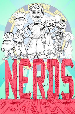
Ethen then combined the two ideas in to a final sketch


Then we took it to a cover meeting to see if we were on track.
Turns out we were!


Final art with out text.

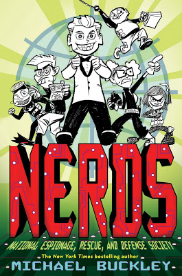
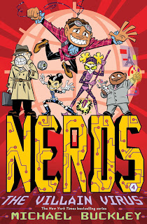
Final Cover with text


Back cover design

Each book features a character. Book 1 features Jackson " Braceface" Jones, the new recruit. The fourteen pounds of metal in his mouth make him the team's go-to gadget guy!

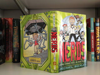
One last bit a of business the CASE COVER! 

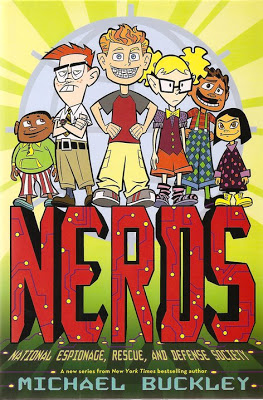
Did you know we designed the case covers for NERDS series with a different image than the jacket. I knew it you didn't. Who looks at the case cover anyway. GULP! I do.


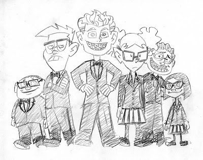
Case Cover

The idea for the different case was to reveal the NERDS secret identities as normal kids. Apparently when they are not saving the world they also become fashion disasters.


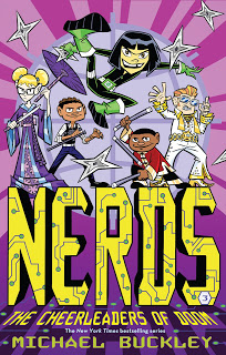
Also in the NERDS series


About the book
Michael Buckley is at his comic best in this madcap new series sure to appeal to kids looking for a quick, exciting read.

Combining all the excitement of international espionage and all the awkwardness of elementary school, NERDS, featuring a group of unpopular students who run a spy network from inside their school, hits the mark. With the help of cutting-edge science, their nerdy qualities are enhanced and transformed into incredible abilities! They battle the Hyena, a former junior beauty pageant contestant turned assassin, and an array of James Bond–style villains, each with an evil plan more diabolical and more ridiculous than the last.

F&P level: V

Praise for NERDS
“An action-packed, tongue-in-cheek take on the world of superheroes and villains. The pacing is quick and the action is plentiful—kids will almost hear the sound effects as they read. NERDS brings a worthy message to the fore—that uncool kids can grow up to be anything but. Funny, clever, and thoroughly entertaining, this title should be popular.”
School Library Journal 

"The unique format of this book, combined with the imaginative and playful storyline, will appeal to many readers."
Children's Literature

About the author
Michael Buckley is the author of the New York Times bestselling series and Today Show Al Roker Book Club pick The Sisters Grimm. He has also written and developed shows for Nickelodeon, Disney, MTV Animation, the Sci- Fi Channel, the Discovery Channel, and VH1. He lives in Brooklyn with his wife, Alison, and son, Finn.


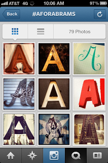
A for ABRAMS


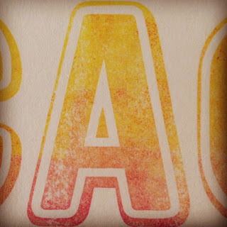
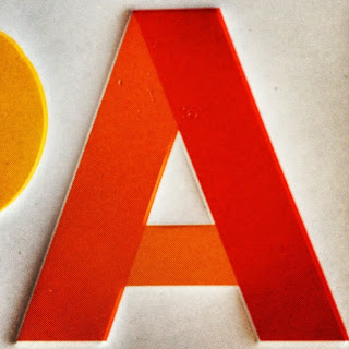
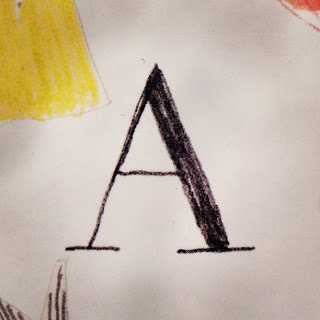
We over here at ABRAMS KIDS have started a campaign on Instagram and Twitter called A for ABRAMS ( #aforabrams ) We are collecting A's that are artful, well designed, or just plain cool from anywhere that you might find them. The idea is whenever you happen to see one of these artful A's out and about you can join us by hash tagging your A #aforabrams as well as including our Instagram or twitter handle @abramskids or @abramsbooks.  Have some fun and we hope you all get to see the world around you a little better.

Here area few examples of different A's I have found.

You can find artful A's in our books!


From PANTONE COLORS designer by Meagan Bennett


From  I HAD A FAVORITE DRESS by Julia Denos

Or on your favorite wimpy book!


Or you can be crafty and make one to hang on your window.


Or you can find one in your local Museum!


 Found at MOMA


Or at your local bookstore!


Found at R. J. Julia Independent Booksellers in Madison, Ct


Or at your favorite restaurant!


Found at Prime Meats in Carroll Gardens, Brooklyn


Good luck hunting! A for ABRAMS #aforbrams @abramsbooks and @abramskids


Fall 2012 Amulet Books Cover Preview

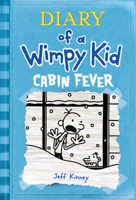
BREAKING NEWS! DIARY OF A WIMPY KID: CABIN FEVER
Hold on Tight, this Winter has Bite


USA TODAY, the #1 paper in the country with a 1.8 million circulation,

broke the news this morning that

DIARY OF A WIMPY KID: CABIN FEVER

the sixth book in the game-changing series by Jeff Kinney,

will go on sale November 15, 2011, with a 6-million copy first printing—the largest to date!

They are also the first to run the cover, which will be “ice blue.”

Please see the full press release attached and below. We expect all major daily trades to follow today and tomorrow.


FIRST PRINTING OF MORE THAN 6 MILLION COPIES OF

DIARY OF A WIMPY KID: CABIN FEVER,

BOOK 6 IN THE #1 BESTSELLING SERIES BY JEFF KINNEY,

FROM AMULET BOOKS

NATIONAL LAYDOWN IS TUESDAY, NOVEMBER 15, 2011

SUMMER “SNOWBALL” EVENTS WILL THRILL AND CHILL FANS


New York, NY, June 16, 2011—Amulet Books, an imprint of ABRAMS, revealed today in a major press announcement the title, first-printing quantity, and cover of the sixth Diary of a Wimpy Kid book. CABIN FEVER will have the largest first printing of any title in the series to date, with more than 6 million copies, making it the largest print publishing release of 2011 when it goes on sale Tuesday,

November 15. The cover color is ice blue, which complements the red, blue, green, yellow, and purple of the first five #1 bestselling books. Cabin Fever follows the sales and publicity momentum of the

March 2011 release of the #1 bestseller the Wimpy Kid Do-It-Yourself Book, a journal filled with interactive pages and space for readers to record their own stories. In Cabin Fever, the Heffley family is stuck indoors during a blizzard. But will they weather the storm?

A very tough New England winter inspired me to snow the Heffley family in for the holidays,” said Jeff Kinney. “‘Cabin fever’ refers to the claustrophobia Greg feels, as well as the broader theme of the book. . . that you're trapped by the identity you create for yourself.


Six summer “snowball” events will be announced in July. Featuring the oversized Wimpy Kid Snow Globe that premiered at BookExpo in New York in May, and much more, the events will thrill fans with treats and special book previews. The wide reach of the release of the title will continue in August as kits with branded materials are mailed to booksellers and librarians to help build awareness and excitement.

“This is clearly the most anticipated book of 2011, with the largest initial print run,” said Michael Jacobs, President and CEO of Abrams. Jeff Kinney’s millions of fans are eager with anticipation, and the release of Diary of a Wimpy Kid: Cabin Fever will be an elating experience for them. We’re thrilled to bring millions of kids—and their parents, caregivers, librarians, teachers, and friends—the book this fall, and believe that our laydown of Cabin Fever will help make this holiday season a great one for booksellers. Our pre-sales and marketing campaign over the next few months will help build that excitement and anticipation for our laydown of Jeff’s next number-one bestseller.”

Books in the core Wimpy Kid series by Jeff Kinney include Diary of a Wimpy Kid (2007), Diary of a Wimpy Kid: Rodrick Rules (2008), Diary of a Wimpy Kid: The Last Straw (2009), Diary of a Wimpy Kid: Dog Days (2009), and Diary of a Wimpy Kid: The Ugly Truth (2010). Jeff Kinney has also written and illustrated The Wimpy Kid Do-It-Yourself Book and The Wimpy Kid Movie Diary. The series is a fixture on the USA Today bestseller list (the first book in the series has remained in the top 150 for more than 200 weeks) and the Wall Street Journal and Publishers Weekly bestseller lists. It has also remained consistently in the top spots on the New York Times lists since publication of the first book in the series.

More than 50 million Diary of a Wimpy Kid books are in print in the United States and Canada. The books have been sold in more than 36 countries in 35 languages around the world. Published by Amulet Books, an imprint of ABRAMS, Kinney’s work has been widely praised for its ability to turn reluctant readers onto books. Jeff Kinney was named one of TIME magazine’s most influential people in the world. The first movie based on the books, Diary of a Wimpy Kid, grossed more than $75 million worldwide in box office sales, and the second movie, Diary of a Wimpy Kid: Rodrick Rules, was the #1 movie at the box office in its opening weekend in theaters. The book series won Nickelodeon Kids’ Choice Awards in 2010 and 2011, and Jeff Kinney was nominated for a Children’s Choice Book Award in 2009, 2010, and 2011. Books in the series have won numerous awards voted on by students and teachers in schools around the globe. In March 2011, the first-ever Wimpy Kid Island, Wimpy Wonderland, debuted on www.poptropica.com.

# # #

For more information, interviews, or images, please contact:

Jason M. Wells

Executive Director, Publicity and Marketing

Abrams Books for Young Readers/Amulet Books


Evolution of LIKE PICKLE JUICE ON A COOKIE cover


I had a bad August.
A very bad August.
As bad as pickle juice on a cookie.
As bad as a spider web on your leg.
As bad as the black parts on a banana.
I hope your August was better.

I really do.

When Eleanor's beloved babysitter, Bibi, has to move away to take care of her ailing father, Eleanor must try to bear the summer without Bibi and prepare for the upcoming school year. Her new, less-than-perfect babysitter just isn't up to snuff, and she doesn't take care of things like Bibi used to. But as the school year looms, it's time for new beginnings. Eleanor soon realizes that she will always have Bibi, no matter how far away she is.

Written in a lyrical style with thoughtful and charming illustrations throughout by Matthew Cordell.


Here are a few of Matthew Cordell's first round sketches.


As you might have guessed the title wasn't working for us.
It worked for the story but was just to "quiet."


A list of new possible title was drawn up.


A Letter from Bibi

Waiting for Bibi (she is waiting for the letter after all)

Missing Bibi

Bibi and Me and Our Very Bad August

A Letter from My Bibi

My Life Without My Bibi

Where Old Babysitters Go to Retire
when they Get Sick of Brats, and Why

Kids and the Babysitters that Leave Them

Dealing with an Absent Babysitter

Home Alone

and finally

Like Pickle Juice on a Cookie

Pickle Juice on a Cookie was just odd enough to be enticing. I love it!

Our designer Melissa Arnst rang up Matthew to tell him the new title news.

He then began sketching.


Yet still nothing was clicking.


Melissa start working up other ideas with Matthew's interior art. Our goal was to up the cuteness factor as well as remaining true to the story. Yet this cover seemed to close to another book design. So we took another look.

We combed through the interior art looking for answers. I was sure they were there somewhere.


We replayed the title over and over in our heads. Like Pickle Juice on a Cookie was so attention getting we needed an image that would be able to hold its own.


Closer. But still to quiet
Too much scenery.

The answer presented its self on a very small illustration hiding out on the title page art.


Melissa and I then combined her previous sketch with the pickle jar idea and KABLAM!
We had ourselves a sweet cover idea!

Next step: Add type and tweak. (Like many other covers on both the Abrams Books for Young Readers and Amulet Books imprints we asked Matthew for to hand draw the type on the cover. I feel it gives a cover that extra push to being unique. Plus it helps the art and the type look like the belong together.)


Matthews final inked art


Now with color!


And the final!


Front Jacket


Back Jacket


Julie Sternberg, formerly a public-interest lawyer, is a graduate of the New School's MFA program in writing for children. This is her first novel. She lives in Brooklyn. Matthew Cordell is the illustrator of Trouble Gum. He lives in Chicago.


Here is a sneak peek a Julie and Matt's next book

On sale SPRING 2013!!


Praise for Like Pickle Juice on a Cookie
“Eleanor’s ingenuous free-verse monologue should strike a chord with readers, especially those who may have had to cope with the loss of a loved one. Cordell’s halftone cartoons convey the story’s pathos and humor, as well as Eleanor’s changeable moods.” –Publishers Weekly

“Cordell’s winsome cartoon drawings complement the text without overcrowding the verse. It tells a simple, poignant story that will resonate with any child who has ever had to say good-bye.” –Booklist

“This first novel is a promising debut. Eleanor’s concerns, not only about her babysitter, but also about playmates, friends and a new school year will be familiar to readers, who will look forward to hearing more about her life.” –Kirkus Reviews

“Sternberg hits all the right notes here, capturing a sensitive kid’s first experience of loss with tender respectfulness and full acknowledgment that separation is a bereavement too. Sprightly line drawings, with the same perky homeyness as the story, add visual energy.” –Bulletin of the Center for Children’s Books

“Heartfelt, accessible, and energetic…” –Bulletin of the Center for Children’s Books

"This heartwarming novel and its winsome cartoon-like illustrations draw readers right into the story. Children would enjoy this short chapter book as an independent read, but it would also be a particularly good choice for parents to read to or with their children." –BookPage


Authors: By Julie Sternberg, illustrated by Matthew Cordell
Imprint: Amulet Books
ISBN: 0-8109-8424-5
EAN: 9780810984240
Availability: In Stock
Publishing Date: 3/1/2011
Trim Size: 5 1/2 x 7 1/2
Page Count: 128
Cover: Hardcover with jacket
Illustrations: 50 B&W illustrations


Be sure to follow @abramskids on Twitter and Instagram!

Evolution of the Sweet Treats & Secret Crushes cover


The story of how the Sweet Treats & Secret Crushes cover came to be started with Lisa's first book My Life in Pink & Green. This cover was a huge success and perhaps the easiest cover I have ever worked on. I credit this cover to a relaxing Sunday afternoon. I had just finished a large tasty sandwich from Los Paisanos in Brooklyn. My eyes were heavy and bored from watching the Sunday afternoon TV which means golf, a nap soon followed. Sadly, I was dreaming about work in particular this cover problem only to wake with an idea. Below is a sketch of my first idea which as you can see pretty much became the cover. Only I cropped out the potato chip grease from my fingers.


The final cover


There is only one problem to having a successful cover idea . . . repeating that success. Ugh!
Since this cover idea went over so well everyone from sales, editorial and even buyers want deanother "Pink & Green" cover. Sure sounds great, right? Only Sweet Treats & Secret Crushes was its own story and didn't really work with the design of "Pink & Green." The other issue was now that we launched Lisa Greenwald, we wanted to create a brand look for her books. Ugh! How to do all this and make it look like it belongs with "Pink & Green." This was going to take more than tasty sandwich induced genius.


When a blizzard threatens to ruin Valentine’s Day, three seventh-grade friends make and distribute fortune cookies to their lonely neighbors—and confront the secrets they’ve been keeping from one another.

Confident Kate doesn’t notice much but the latest gossip, and shy Georgia can’t say out loud what’s always on her mind. They’re joined by observant, careful Olivia, whose epic, single-minded crush on PBJ (real name: Phillip Becker-Jacobs) is starting to frustrate the other two. Using fortune cookies that mysteriously always seem to speak directly to the person who opens them, the three girls try to work together to bring some love to their building, while reminding each other why they’re such good friends to begin with.


With all the right ingredients to appeal to tween girls.


I started at the beginning trying many different and same approaches. Since the girls make cookies. Why not have the same design as "Pink & Green?"

But it just didn't work with the book. This book had three main characters. Olivia, Kate and Georgia. So having one person on the cover didn't seem right. Perhaps I need to just try a new direction all together and focus on the cookies and that the book is set on Valentines Day in a snow storm.

Flower as snow? Thanks to Martha Mihalick for messing up her kitchen


Still not right but a few pieces seemed to work.
1. Vibrant colors
2. Snow pattern
3. Font choice

Things that didn't work
1. There was still the problem of on image representing 3 main characters
2. It didn't look like "Pink & Green."


Still sticking with the heart cookie and snow theme. Here you see I we have three cookies representing each girl.


At this stage we were far enough along that we felt it was time to start photographing the elements we needed. I hired photographer and friend Morgan R. Levy to shoot the heart cookies and a few other props. Lucky for me it was almost Valentines day and Betty Bakery had the exact cookies I was looking for.


The next day once the cookies were baked Morgan and I set up shop in my kitchen to start photographing


Kentucky watched

Here are a few out takes

Back cover ideas.
Olivia, Kate and Georgia make cookies to give to there friends and place them in Chinese food containers.


Snowflake mesh pattern for background.

We also shot fortune cookies. The girls actually bake fortune cookies in the story.


At this point Morgan left for Iceland to work on her thesis.


There was still talk at this point that the cover was still not syncing up with "Pink in Green." The problem was we had left out any human presence. We needed a human element. But how to do this with out showing a face or a figure. I went back and took a look at "Pink in Green", going over all the elements. The hands, the hands. These were the elements we were looking for the connect it all together. By simply placing them in much the same posed as on "Pink in Green" it helps the viewer visually connect the two books.


The next problem in Morgan's absence I hired photographer Jonathan R. Beckerman, my brother. He was the photographer for My Life in Pink & Green. Normally Jonathan is my go to photographer for all photographic covers but earlier in the project he was all booked up. He and I have worked on many covers together. Such as Struts & Frets, Anxious Hearts, Troy High, The Girls, and Anahita's Woven Riddle. Now I needed some hands. With in the week he delivered just the right ones.


Back cover design mimics the layout of My Life in Pink & Green


The final cover


Final layouts

Spot Gloss sparkle layer


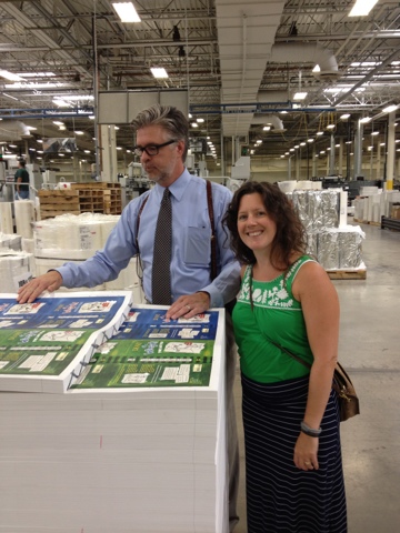
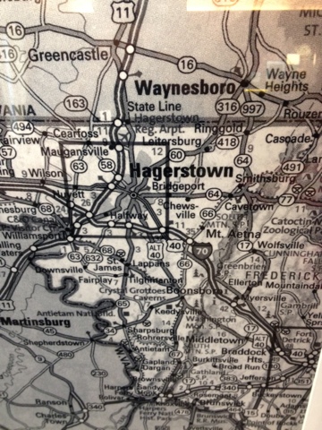
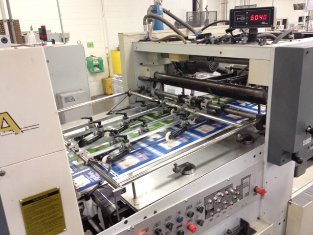
Jacket proofs at the printer in Hagerstown, Maryland


Holy Pickles! I am now a CREATIVE DIRECTOR!


“By working faithfully eight hours a day you may eventually get to be boss and work twelve hours a day.”- Robert Frost (NUTS!)


At Abrams, Susan Van Metre has been promoted to svp and publisher and will now oversee all comic arts books in addition to Abrams Children's and Amulet Books. Charles Kochman is promoted to editorial director for Abrams ComicArts, adding oversight of children's comics and graphic novels, reporting to Van Metre. Chad W. Beckerman moves up to creative director and oversee design for all comic arts books, Abrams Children's and Amulet.

The WIMPY KID Macy's Thanksgiving Day Balloon Revealed


Recently I headed out west on a secret mission. What was that mission . . . ?

You guessed it. We went to check out The WIMPY KID Macy's Thanksgiving Day Balloon. Below are photos of our sneak peek.


This mold reveals all the different sections that need to be sewn together for the balloon to take flight. See all the lines!

Above is the balloon model and the actual balloon in flight.

Inside the balloon head.


Flat


Today the ABRAMS team traveled out to East Rutherford, New Jersey for the first outdoor test of the Wimpy Kid balloon as well as training to become balloon handlers. The ABRAMS team including myself will be balloon handlers during the parade. Thanksgiving day promised to be a long memorable day.


Merle and Kristina held down Greg's foot with all there might.


Michael Jacobs


MORE PHOTOS WIMPY KID MACY'S THANKSGIVING DAY BALLOON


Earlier this summer Jeff Kinney and his trusted team ( Charles Kochman, Jason Wells and myself ) took a trip to the Macy's Studios just over the Hudson river in New Jersey. Here they make all the floats and balloons that are seen in the parade Thanksgiving morning. It was like visiting Santa's workshop.


Jeff Kinney and team arrive at the Macy's Studio in New Jersey

Who knew the balloons started out as clay sculptures?
This was the first time Jeff was seeing his creation, Greg Heffley in 3D


Jeff works on the design of Greg's mouth


The original drawing by Jeff Kinney for the balloon. ( Below )

Macy's drawing of Greg in 3D


Sculpting tools


First a 3D clay sculpture is made.


Jennifer Palmer awaits Jeff's carving instructions


A figure is added to show scale

Charles Kochman lends his keen eye to the process


On Press for Diary of a Wimpy Kid : The Ugly Truth


On Press for Diary of a Wimpy Kid : The Ugly Truth


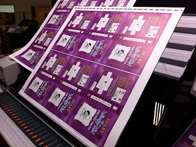
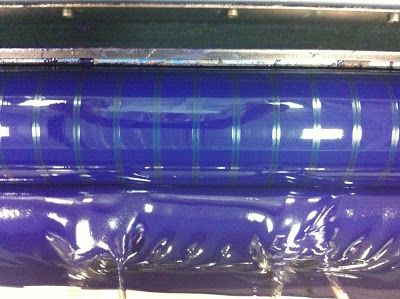
Earlier this Summer I took my annual trip out to Hagerstown, Maryland to color correct the cover for Diary of a Wimpy Kid : The Ugly Truth. My job make sure the Purple prints correctly on 5 million copies. No pressure.


The Purple Equation


Paper for 5 Million copies


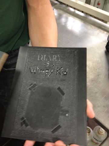
Debossing
template for cover effects


Yellow ink on press


Blue Ink


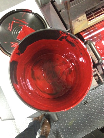
Red Ink


Paper waiting to be made into covers


I made this video last year for DOG DAYS. Basically the video would be the same this year so just imagine purple instead of yellow. Way easier than me making another video. Thanks for helping out.

DIARY OF A WIMPY KID MACY'S THANKSGIVING DAY BALLOON


Jeff Kinney and team arrive at the Macy's Studio in New Jersey


Jeff works on the design of Greg's mouth


New York, NY, September 30, 2010—Get ready for Jeff Kinney’s Wimpy Kid as you’ve never seen him before! Amulet Books, an imprint of ABRAMS, and Macy’s announce the 2010 debut of the Diary of a Wimpy Kid balloon in the 84th annual Macy’s Thanksgiving Day Paradeâ. Stepping off on Thursday, November 25, 2010, the Macy’s Parade is broadcast nationally on NBC-TV, from 9 A.M. to 12 P.M., in all time zones. In 3-D for the first time, Wimpy Kid is one of two new giant character helium balloons that will debut in the legendary Parade lineup this year, joining 13 other helium giants. The Parade is part of a series of initiatives celebrating the release of the fifth book in the series, Diary of a Wimpy Kid: The Ugly Truth, which is on sale Tuesday, November 9, 2010, with a first printing of 5 million copies.

“I’m incredibly excited that Diary of a Wimpy Kid has been chosen to be a part of Macy’s Thanksgiving Day Parade,” said Jeff Kinney. “When I think of all of the iconic characters that have flown in years past, I feel humbled and honored that my character will be a part of the Parade’s history.” ABRAMS president and CEO Michael Jacobs added, “Kids and adults alike will be delighted to see and experience their favorite children’s book character rendered ‘larger than life.’ We are thrilled Wimpy Kid will be shared with millions—in person and on TV around the world—at a grand new height.”

In addition to seeing their favorite character take a larger-than-life form, Wimpy Kid fans are encouraged to enter a sweepstakes to win a trip to New York to see the Diary of a Wimpy Kid balloon up close. Open for entries on September 30, one lucky winner and three guests will celebrate the Thanksgiving holiday in New York along the Parade route. The winning entry will receive airfare for four people, a hotel room for two nights, and VIP grandstand tickets to watch the Parade live as it makes its way down the streets of New York City. Full details and an entry form can be found by going to www.abramsbooks.com/wimpykidsweepstakes. Entries will be accepted through October 30, 2010.

“The Macy’s balloon line-up will once again reach new heights this year with the debut of Diary of a Wimpy Kid,” says Amy Kule, producer of Macy’s Thanksgiving Day Parade. “Jeff Kinney’s character is iconic for the millions of children who empathize and relate with his trials and tribulations. We are excited to welcome him into the Macy’s Parade family and can't wait to see the smiles of children everywhere when they see him take flight on Thanksgiving Day.”

For more than 80 years, Macy’s Thanksgiving Day Parade has been the official kick-off of the holiday season. Every year, the

Parade is seen by more than 3.5 million people who line the streets of New York and more than 50 million people who tune into NBC to watch the giant balloons, one-of-a-kind floats, the nation’s best marching bands, hundreds of cheering clowns, and a host of celebrities ring in the holidays.

Since publication of the first Diary of a Wimpy Kid book in April 2007, more than 37 million books are in print in the United States, and the books have been sold in more than 30 countries around the world. Published by Amulet Books, an imprint of ABRAMS, Kinney’s work has been widely credited for its ability to turn reluctant readers on to books. In 2010, the movie adaptation of Diary of a Wimpy Kid grossed more than $60 million in box office sales, the book series won a Nickelodeon Kids’ Choice Award, and books in the series won numerous awards voted on by students and teachers in schools around the globe. In 2009, Jeff Kinney was named one of TIME magazine’s most influential people in the world. A second movie is in production now and is expected to be in theaters March 2011.

Books by Jeff Kinney include Diary of a Wimpy Kid, Diary of a Wimpy Kid: Rodrick Rules, Diary of a Wimpy Kid: The Last Straw, Diary of a Wimpy Kid: Dog Days, Diary of a Wimpy Kid Do-It-Yourself Book, and The Wimpy Kid Movie Diary. The next book, Diary of a Wimpy Kid: The Ugly Truth, goes on sale Tuesday November 9, 2010. The series is a fixture on the USA Today, Wall Street Journal, and Publishers Weekly bestseller lists, and has remained consistently in the top spots on the New York Times lists since publication.

What did you do this weekend?

Well, I know what I did!


Friday night I attended a show at the Society of Illustrators called Blow-Up. Three illustrators with vastly different backgrounds: Tomer Hanuka, Yuko Shimizu, and Sam Weber. It is quite possibly the best show I have ever seen at the Society in quite sometime. If you are in the New York area, I highly recommend that you head over to 63rd street and Lexington and take a look.


Lauren Castillo chats it up.

Saturday was our neighborhood block party.


Where for some reason a neighbor asked if I want to judge the block Dog Show.
I could have said, "NO", but who turns down and offer like that? The categories were
1. Best dressed 2. Cutest 3. Most Unique. What kind of category is Most Unique anyway?

Remove Formatting from selection


I left the block party early to attend Michael Buckley's book party at
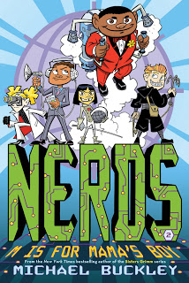
Powerhouse Books fro NERDS 2: M is for Mama's Boy.


Michael's son Finn was also in attendance
Later Saturday night I attended Illustrator | Rock Star gig at the Gun & Rod Club in Williamsburg


Marcellus Hall works on his set list


The drummer, Chris Raymond


Sunday, I took it easy.

I had brunch and a nice drink at Prime Meats.


Later I went on the hunt for a new book.


Did a couple drawings

For more Drawings click here
http://cwdrawings.blogspot.com


And then took in a sunset.


What did you do?

Sophie Blackall Prime Meats Final Art Drop


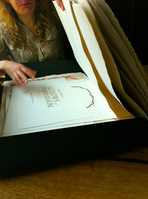
This morning as I do most weekends mornings I had breakfast at Prime Meats in Carroll Gardens. Only on this particular Sunday morning I was meeting Sophie Blackall. She was waiting paitently for me. Next to her sat a portfolio with her final art for Aldus Huxley's only picture book The Crows of Pearblossom. Both of us were in need of a coffee. Sophie because she pored everything she had in the finishing the final art the night or hours before and I from celebrating a friends birthday. What she was about to show me was beyond my wildest expectations. I can't wait to share more about the making of this book very soon. In the mean time here are some photos from The Crows of Pearblossom the Art Drop.


Also I highly recommend Prime Meats for a tasty breakfast.


Other links Sophie Blackall's interview at Seven Impossible Things

Diary of a Wimpy Kid: The Ugly Truth (5) Press Release


THIS FALL . . . EVERYTHING CHANGES.

MORE THAN 5 MILLION COPIES OF

DIARY OF A WIMPY KID: THE UGLY TRUTH,

BOOK 5 IN THE BLOCKBUSTER SERIES BY JEFF KINNEY,

TO BE PRINTED AND DISTRIBUTED BY AMULET BOOKS.

NATIONAL LAYDOWN IS TUESDAY, NOVEMBER 9, 2010

FIRST-EVER BOX SET OFFERS NEW CONTENT FOR FANS


New York, NY, July 29, 2010—Amulet Books, an imprint of Abrams, reveals today in a major press announcement the title, first-printing quantity, and cover of the fifth Diary of a Wimpy Kid book. The Ugly Truth will have the largest first printing to date of any title in the series, with more than 5 million copies, making it one of the largest publishing releases of 2010 when it goes on sale Tuesday, November 9. The cover is purple, following the red, blue, green, and yellow of the first four #1 bestselling books, which are available together for the first time this September in the Diary of a Wimpy Kid Box of Books, which features an original Rowley Jefferson cartoon. The Ugly Truth follows the sales and publicity momentum of the #1 bestseller The Wimpy Kid Movie Diary, a nonfiction book by Jeff Kinney published to coincide with the March 2010 release of the feature movie version of the first Wimpy Kid book. The Ugly Truth is a pivotal installment in the series and a must-read for fans.

“To me, the fifth book is the linchpin of the series,” said Jeff Kinney. “Since Greg Heffley is a cartoon character but also a literary character, I’ve always wondered if he should grow up or stay in a state of arrested development forever. This book answers that question once and for all.”


“With The Ugly Truth, Jeff Kinney takes his readers in a whole new direction,” said Charles Kochman, executive editor of the Wimpy Kid series. “All of the favorite characters will be back but, like Greg Heffley, you will see them in a new light as Jeff explores the reality of adolescence.”

The wide reach of the release of the title will include national publicity and a special promotion on the popular children’s website www.poptricpica.com, which will offer users a unique reveal of the cover on July 29, 2010. Kits with branded materials will be mailed in August to booksellers and librarians to help them build awareness and excitement.

Diary of a Wimpy Kid: The Ugly Truth is the most anticipated book of 2010, with the largest initial print run and with Jeff Kinney’s millions of fans elated with anticipation. And we at Abrams are happy to do our bit in bringing millions of kids—and their parents, caregivers, librarians, teachers, and friends—into stores for books this fall, starting with the release of the Diary of a Wimpy Kid Box of Books gift set next month.

“We believe that our laydown of The Ugly Truth will bring traffic into stores and help make this holiday season an upbeat one for booksellers. As we roll out our pre-sales and marketing campaign over the next few months, we know that the excitement will skyrocket and that we may well go back to press to cover increased demand.”

Since publication of the first Diary of a Wimpy Kid book in April 2007, more than 35 million books are in print in the United States, and the books have been sold in more than 30 countries around the world. Published by Amulet Books, an imprint of ABRAMS, Kinney’s work has been widely credited for its ability to turn reluctant readers on to books. In 2010, the movie adaptation of Diary of a Wimpy Kid grossed more than $60 million in box office sales, the book series won a Nickelodeon Kids’ Choice Award, and books in the series won numerous awards voted on by students and teachers in schools around the globe. In 2009, Jeff Kinney was named one of TIME magazine’s most influential people in the world. A second movie is in production now and expected to be in theatres in March 2011.

Books by Jeff Kinney include Diary of a Wimpy Kid, Diary of a Wimpy Kid: Rodrick Rules, Diary of a Wimpy Kid: The Last Straw, Diary of a Wimpy Kid: Dog Days, Diary of a Wimpy Kid Do-It-Yourself Book, and The Wimpy Kid Movie Diary. The series is a fixture on the USA Today, Wall Street Journal, and Publishers Weekly bestseller lists, and has remained consistently in the top spots on the New York Times lists since publication.

Order now!

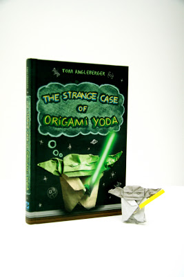
Evolution of the The Strange Case of Origami Yoda cover

A long time ago in a galaxy far, far away . . . .
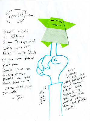
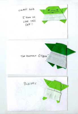
Tom Angleberger sent me a small Origami Yoda


He sent chubby ones, some with faces and others without. Tom made dozens of different Origami Yodas. Searching for just the right one for the cover.

Below is a video showing how Tom makes his Origami Yoda.


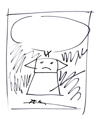
As Tom searched for just the right Yoda. I began to think of how the cover might be laid out. Below is a 1st attempt sketch using the Star Wars font.


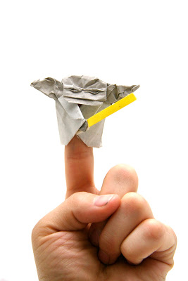
Only this seemed to obvious a direction. Yoda needed a face but how do you get a face from folded paper? The force was strong with Jedi Master Angleberger on this problem. A few weeks later Tom sent me this ( see below ) new and improved Yoda. Now with a light saber and crinkled brow!


Now that we had just the right Yoda. All that was left was to find the correct back drop. Since the story is set in a school the enviroment seem like a no brainer. We through around different ideas for the back drop. Crinkled paper? Lockers? Bulletin board? Final we settled on a chalk board. Which would also give the appearance of looking like space.

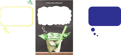
My thumbnail sketch ideaHow do you treat the text? Now that we settled on a chalkboard for the backdrop the font and how the text would be rendered must blend into the environment seamlessly. To prevent the text seeming like it was just laid on top of the design. Since Dwight, a loser, talks to his classmates via an origami finger puppet of Yoda. There seemed like only one solution to this problem

Solution: Thought Bubble and a font that looks like it was drawn on a chalkboard.

Next step: Designer Melissa Arnst worked up a thought bubble designs and photographed
a chalk board to get that school time atmosphere.


A font is chosen. Only the design is still not sitting well with me. The colors are to dull and the title doesn't command the space it is in. It's still missing some character.


Solution: Illustrator Jason Rosenstock. Jason using his vast illustration abilities, renders the type to perfection, tweaks the color saturation and drew little chalk drawings as well as a couple x-wings and planets.


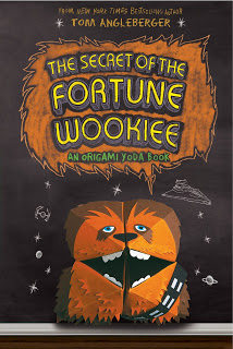
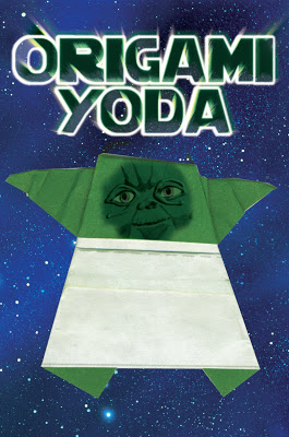
And there you have it a perfect Origami Yoda cover! May the force be with you.


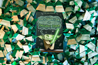
The book surrounded by 1,000 Origami Yodas
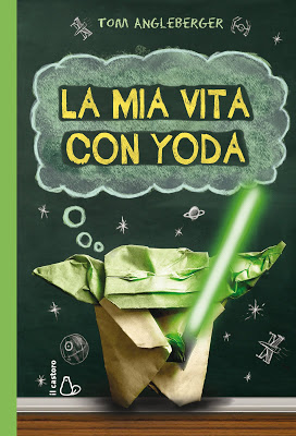
Italian Edition
About the book
In this funny, uncannily wise portrait of the dynamics of a sixth-grade class and of the greatness that sometimes comes in unlikely packages, Dwight, a loser, talks to his classmates via an origami finger puppet of Yoda. If that weren’t strange enough, the puppet is uncannily wise and prescient. Origami Yoda predicts the date of a pop quiz, guesses who stole the classroom Shakespeare bust, and saves a classmate from popularity-crushing embarrassment with some well-timed advice. Dwight’s classmate Tommy wonders how Yoda can be so smart when Dwight himself is so clueless. With contributions from his puzzled classmates, he assembles the case file that forms this novel.

About the author
Applying for a job as a newspaper artist, Tom Angleberger was mistakenly assigned to cover local government meetings. Fifteen years and countless town council meetings later, he is still writing instead of drawing, currently as a columnist for the Roanoke Times in Roanoke, Virginia. He began work on his first book while in middle school. Tom is married to author-illustrator Cece Bell. They live in Christianburg, Virginia.