New Drawings
Portfolios and Promo Cards
At a recent event I was asked two questions:
1."When is your portfolio drop-off day"
2."Do you like getting 'portfolio' cards in the mail.
I had the same answer for both "No".
Now this is by no means a universal opinion but rather my own. My answer got me to thinking of the why? Why do I feel this way. I see a ton of cards pass my desk everyday which I scan through so fast that it seriously isn't worth the time that is but into them or the money. Some are really amazing. But I think they might be a waste, at least for me. What I would rather see is work on a website or Blog or some sort of online posting. Save your sell some stamps and some trees and get your work online.
Second I like most art directors these days don't have much time left in there day to see new portfolios on drop-off days. We will call artist in when we need to see there work. ( which we find on sites, from reps, and artist recommendations) Why is this? It was not long ago that an Art Director would have illustrators in to look over there work together. The Art Director had more time in a way to see new work. Before computers publishers worked on fewer books and thus had more time to look and cultivate new talent. When you work on over 70 books, plus 26 calendars a year, unfortunately you have little time to see new work. This doesn't mean I don't want to, I do. But working on more books means that there is more work out there than there was 20 or even 10 years ago.
So how do you get me to see your work?
As I suggested before, get your work online. I love looking at new sites. We all waste time in the morning on the Internet. So why not have me looking at your site over a tasty sausage, egg and cheese breakfast sandwich. But again, how do you get me to look at you site. I have created a email address for you to send your site address too. This way you are not clogging up my work email which can be quiet troublesome.
portfoliodrop@gmail.com
Let's see how this little experiment works out.
White Whale
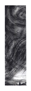
Storm Drawings
My First Drawing From My New Studio
Process and Refinement
Society of Illustrators Original Art Exhibition
Rodrick Rules!
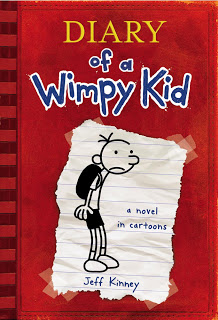
I have been away for a while now. Where have I been you ask? Well adventuring on the high seas looking for exotic species of rare night fish of course. But when I got back I got right to work on the next installment of the Diary of a Wimpy Kid series. Here is a sneak peak at what the cover of DIARY OF A WIMPY KID: RODRICK RULES! Book two in the series. Releasing sometime in early January 08.


Something to Blog About
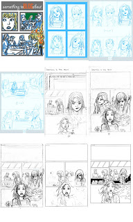
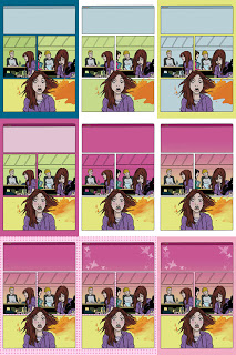
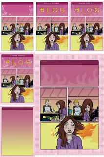
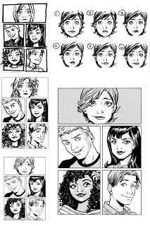
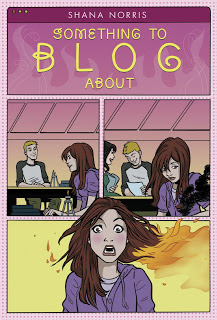
A little while ago I mentioned that I was designing a novel based on a Blog. The title of this book is now "Something to Blog About." This has not been an easy one to work on. Mainly because as a designer it is very easy to go down the road that has been travel so much—cut off faces, bad stock images to make it look literary or like some sort of angsty character on the cover, but not this book we won't let it happen. I have always wanted to keep it graphic. So of course I took suggestions and checked out other blog designs. Only for a jacket it wasn't enough. I needed an image to hold it together. Two scenes played over and over in discussions of the jacket; one in which Libby burns her hair in chemistry class in front of a boy she is crushing on and the other where she trips in front of the boy crush Seth Jacobs. I was thinking of showing this in some graphic silhouettes with other graphic elements to fancy it up a bit. And then I realized I had a chance to use some artist that I have always wanted to work with.
Stay tuned to see what happens next.
Stay tuned to see what happens next.
Upcoming Interview idea
I have decided to take lead from other Blogs and begin an interview section to Mishaps and Adventures. The idea would be to interview other designers, Art Directors, Publishers and Artist. My hope is to start with delving into the processes of making a book and what publishers are looking for in hopes of making it a teaching tool for others ...ambitious I know.
So class now is the time if you have any questions you might like to ask about anything publishing related. I will take them very seriously an use them as possible questions in these interviews. I figure this will help me ask questions that you want answers to.
Possible interviews include Howard Reeves ( Publisher of Abrams Books for Young Readers and Amulet Books), David McPhail (Illustrator), Jeff Kinney (Author and Illustrator of Diary of a Wimpy Kid), Kelly Murphy (Illustrator), and Neil Swaab ( Designer and author of Rehabilitating Mr. Wiggles) to name a few..
And since I like to include an image everytime I post, here is a drawing I did of a couple of birds.
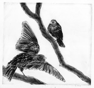

My Commute Home 5.30.07
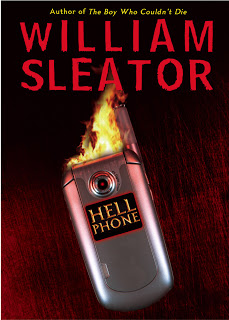
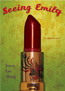
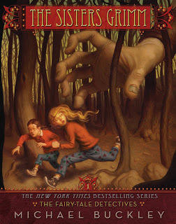
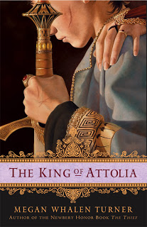
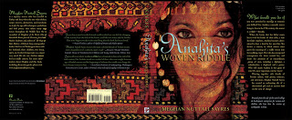
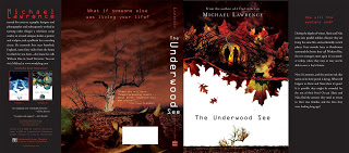
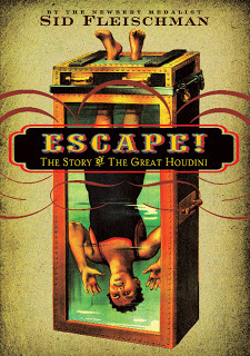
Some of My YA Design work.
How to make a Picture Book Jacket, that works.
I would like to start delving into what makes a good jacket for a picture book. (This is by all means open for discussion) Far to often I will receive postcards and dummy books in the mail from Illustrators which give little or no thought to a jacket image. This is a mistake. In my opinion if you can illustrate a good image for the jacket summarizing the story you might have an easier time with the interior illustrations as well. Since you are able to visualize the entire story into one picture successfully. But my all means this is not always the case.
A good portion of the time Illustrators tend to try and use an image from the interior of there book. And I don't blame them after 32 to 40 pages of illustrations, I am sure they are tired of the book and the thought of one more illustration seems daunting. But I think it helps to make the book unique as possible to create an image that stands on it's own.
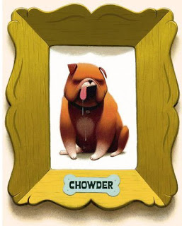
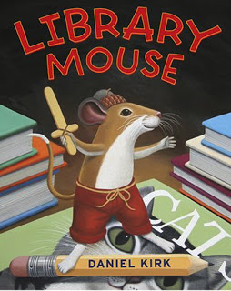
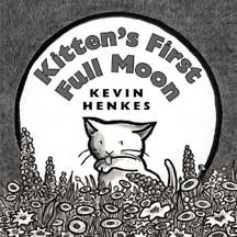
The first thing I suggest, and this goes for novels as well, is to think of one image or character that summarizes the story simply. I find when there is a scene of action it some times makes the jacket very busy. All of the examples below show single character composition. Basically to introduce the character and tell a little bit about the mood of the story with out giving to much away. They are what some call ICONIC covers. Iconic = simple and brand


Hush Little Dragon/COVER ART
Back cover image to FELL
Galley Week
This week is galley hell week. So I might not be posting as regularly as I want to until next week. I am working on 3 galleys all due at the end of the week.
Fell, The Lighthouse War: Book 2 of The Lighthouse Land Trilogy and Hour of the Outlaw. On top of this we are working on getting numerous SPRING 2008 picture books out to press, Because You are my Baby, Hush Little, Dragon and Clinton Gregory's Secret.
If I am not dead or have a stroke from looking at a computer screen for so many hours I will be back and in good form to start this blog of right. Okay that's enough whining.
Here is a picture I did for Greenwillow's Breathe.

Designing a Blog book
My latest project is called LIBBY FAWCETT'S SECRET BLOG by Shana Norris. ( The title will most likely be changing )
I am about half way through reading the book. All the while thinking of possible scenes or imagery that might make a interesting image. The first thought that goes through my head is the word Iconic. I think of this word every time I attempt a novel or picture book design. What does it mean? Simple, yet interesting. Do I always make this happen perhaps not but I try.
First I look at what else has been published in the genre of this book. Blog or internet books. I want to make sure that my design stands out from the rest ( At least I hope so ).
So how do you make a jacket about a blog and make it visually interesting? I am approaching it graphically. Much like some of the banners you might see at the top of some peoples blogs. And really making the type cool. I haven't ruled out any imagery just yet but I really don't want to place some half cropped girl's face or legs or arms or any other body part that seems to be popular in teen novels. That being said I have made a vow to never use straight stock imagery I think it really makes for a very bland image and doesn't stay true to the uniqueness' of the book.
I will report make in a week or so and show my results.
If any of you have certain blogs that you think might help please let me know.
Other Book design blogs
http://covers.fwis.com
Found on this site is a great Interview from one of my favorite Book Designers Vintage's John Gall
http://covers.fwis.com/a_general_theory_of_love
Found on this site is a great Interview from one of my favorite Book Designers Vintage's John Gall
http://covers.fwis.com/a_general_theory_of_love
Adventures in Book Design

After reading several blogs I have notice a need for blog about book design.
In particular Young Adult, Teen and Children's Book design. I will try and write about what I see as common trends good and bad as well as what makes a jacket successful. This is of course all just my opinion and if you feel like I might be leading you astray please by all means lets talk it out.
Let's see where this takes me.


