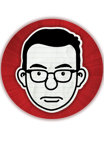
A little while ago I mentioned that I was designing a novel based on a Blog. The title of this book is now "Something to Blog About." This has not been an easy one to work on. Mainly because as a designer it is very easy to go down the road that has been travel so much—cut off faces, bad stock images to make it look literary or like some sort of angsty character on the cover, but not this book we won't let it happen. I have always wanted to keep it graphic. So of course I took suggestions and checked out other blog designs. Only for a jacket it wasn't enough. I needed an image to hold it together. Two scenes played over and over in discussions of the jacket; one in which Libby burns her hair in chemistry class in front of a boy she is crushing on and the other where she trips in front of the boy crush Seth Jacobs. I was thinking of showing this in some graphic silhouettes with other graphic elements to fancy it up a bit. And then I realized I had a chance to use some artist that I have always wanted to work with.
Stay tuned to see what happens next.
Stay tuned to see what happens next.
