I would like to start delving into what makes a good jacket for a picture book. (This is by all means open for discussion) Far to often I will receive postcards and dummy books in the mail from Illustrators which give little or no thought to a jacket image. This is a mistake. In my opinion if you can illustrate a good image for the jacket summarizing the story you might have an easier time with the interior illustrations as well. Since you are able to visualize the entire story into one picture successfully. But my all means this is not always the case.
A good portion of the time Illustrators tend to try and use an image from the interior of there book. And I don't blame them after 32 to 40 pages of illustrations, I am sure they are tired of the book and the thought of one more illustration seems daunting. But I think it helps to make the book unique as possible to create an image that stands on it's own.
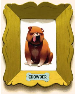
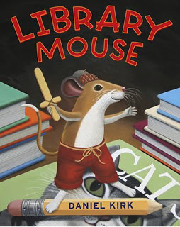
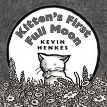
The first thing I suggest, and this goes for novels as well, is to think of one image or character that summarizes the story simply. I find when there is a scene of action it some times makes the jacket very busy. All of the examples below show single character composition. Basically to introduce the character and tell a little bit about the mood of the story with out giving to much away. They are what some call ICONIC covers. Iconic = simple and brand
