It's been awhile since my last Cover evolution post after reading this blog you might forgive me. Usually, I give a couple short phrase about how each stage progressed. This post is a little different. Senior Editor
and artist
will guide us through the cover evolution of
by Corinne Duyvis So let's get started.
First things first your need to know a little about the story.
Amara is never alone. Not when she’s protecting the cursed princess she unwillingly serves. Not when they’re fleeing across dunes and islands and seas to stay alive. Not when she’s punished, ordered around, or neglected.
She can’t be alone, because a boy from another world experiences all that alongside her, looking through her eyes.
Nolan longs for a life uninterrupted. Every time he blinks, he’s yanked from his Arizona town into Amara’s mind, a world away, which makes even simple things like hobbies and homework impossible. He’s spent years as a powerless observer of Amara’s life. Amara has no idea . . . until he learns to control her, and they communicate for the first time. Amara is terrified. Then, she’s furious.
All Amara and Nolan want is to be free of each other. But Nolan’s breakthrough has dangerous consequences. Now, they’ll have to work together to survive—and discover the truth about their connection.
So now let's hear from Maggie Lerhman, Senior Editor:
Otherbound
is an incredibly original book, unlike anything I’d read before. It has interweaving perspectives, male and female POVs, a “normal” Arizona world and a “fantasy” world of the Dunelands, and characters that cross back and forth between them. The incredibly original can be tough to conceptualize in a book cover, since they tend not to have easy comparisons—and Chad and I found to be true in this case. We wanted to get across the idea of seeing the world through someone else’s eyes, and the general concept that there would be two worlds. But pretty much the rest of the cover was up in the air.
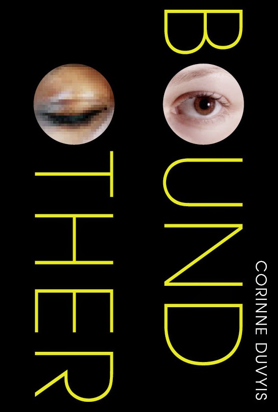
The first few comps that Chad and our designer Sara Corbett came up with tried a photographic/typographic approach. We liked the idea of having one eye open/one eye closed, but these felt a little slick, and they didn’t get across the strangeness and the seriousness of the central concept.
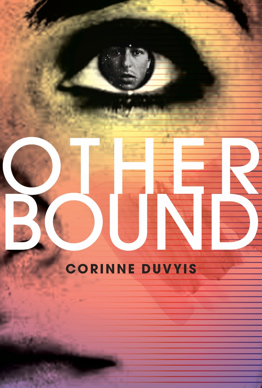
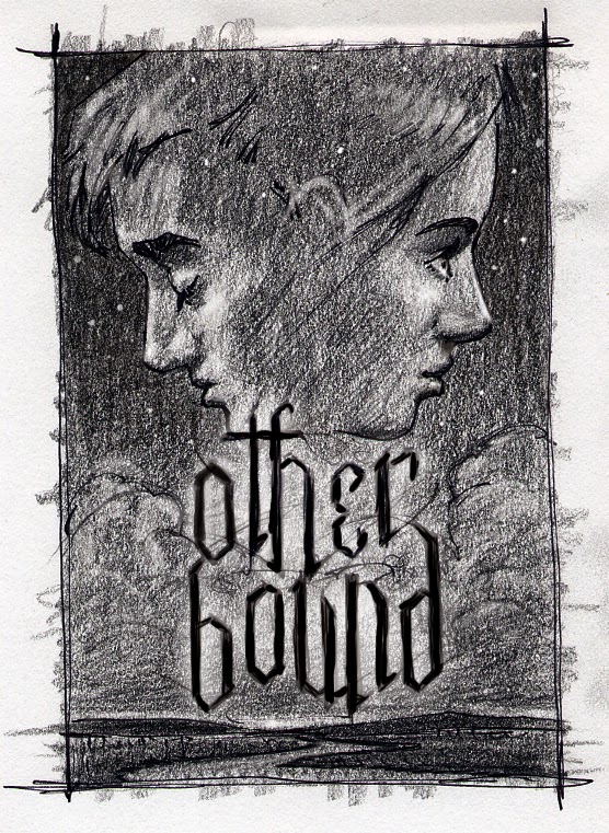
Then Sara and Chad came up with these, which were definitely more mysterious and very striking. Eyes are a natural thing to focus on—Corinne’s original title for the book was
Blink
. But in the end we felt there was something cold about these.
Our publisher expressed the problem concisely: These feel like science fiction, and we wanted to get across more of a sense of the magic and the fantastical.
By this point, we realized we needed to start from scratch…
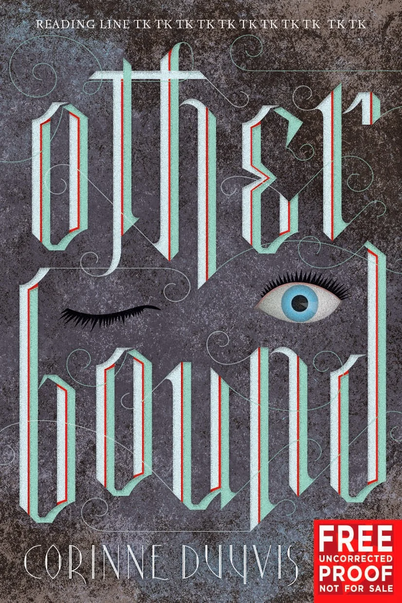
but we’d spent a lot of time on what we’d done already, and our Advance Reader Copies were due to the printer. This was a crucial deadline so that booksellers and reviewers could start reading and talking about Corinne’s amazing book in advance of publication. We hate to have to print an ARC with a non-final cover, but sometimes it happens, and in this case, it was unavoidable. But Chad and Sara made an effort to find a typeface that read more “fantasy.”
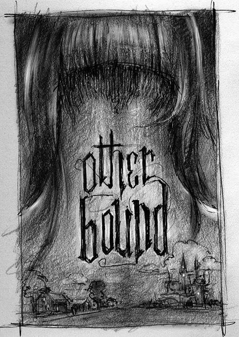
Some of these felt “fantasy,” but a much more medieval-style fantasy that what Corinne had written. The Dunelands are a gritty, rough-edged world. There’s magic, but it’s an earthy, painful strain of magic, not a gowns-and-potions magic. The gothic feel of that type didn’t fit in with how I had pictured that world. Plus it didn’t hint at Nolan’s real-world environment at all—which is half of the book. We eventually went with this blocky interconnected type, which felt to me as if it had been carved out of stone.
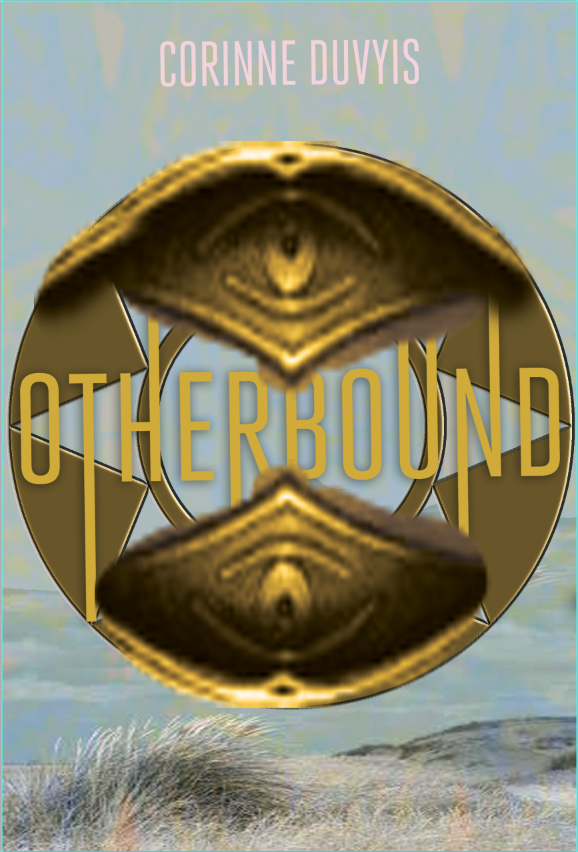
We liked that type for the ARC, but for the final cover, we wanted a more evocative image to go with it. Chad put together this sketch. The idea is from the book: it’s the magical tattoo that servants wear in the Dunelands, with some actual dunegrass below. Something about this didn’t feel right, though. Perhaps it was too mechanical-looking. After all, this is a book that’s very concerned with its protagonists’ bodies—who’s in control, who’s in pain, who gets a say.
( psst, its Chad, At this point in the process I felt a bit lost and tired but not defeated. I wasn't super happy with this direction but it felt right at the time. Mainly because I think it was different than what we had been doing. Which doesn't mean it was the right direction. )
So finally Chad suggested we approach an illustrator he’d worked with before (on the absolutely gorgeous Megan Whalen Turner Attolia covers), Vince Natale.
(CHAD: I had been waiting to work with Vince again and this was the perfect fit for him. It just took me awhile to figure that out. Thankfully the idea of using Vince was conceived.)
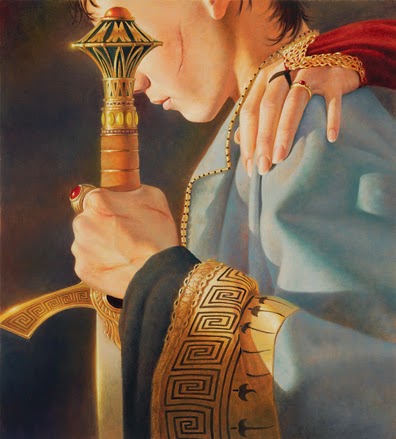
We had total confidence that Vince could bring the fantasy feel to this cover while also introducing compelling characters. He sent several sketches of composition options, all with that old gothic font we’d toyed with for the ARC. Chad took our favorite composition and combined it with the more blocky interconnected type we liked so much in the ARC and Vince went to final.
And now I’ll let Vince take over to discuss some of his process!
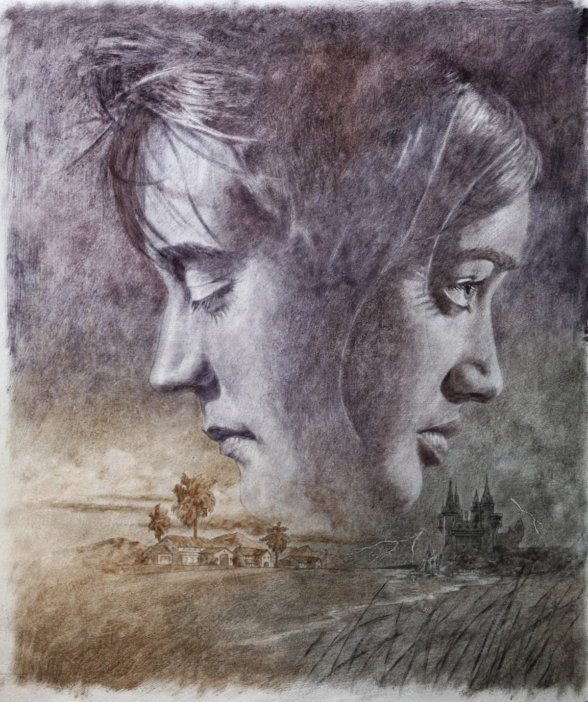
These sketches are my effort to work out details of how to handle the imagery at the bottom of the cover art to include in my tight sketch. I needed to show the separate and differing environments each of the protagonists of the book inhabited - one a typical suburban southwestern U.S. neighborhood, and the other a mysterious, magic filled seaside world.
I needed somehow to meld the two together visually, but keep them separate at the same time. I decided that the best way to do this was to draw them on the same plane at similar sizes and commingle some physical elements, and then make the point of them being separate worlds through the use of color.
In the top sketch I felt that there was too much detail in the 'neighborhood' scene, and that the size of the house was too "in your face", and the composition not fluid enough.
In the bottom sketch I felt that I got more of a 'feel' for the environment neighborhood scene -more houses and more obvious mountains in the background and not so much explicit detail.
The castle, though, I found had gotten a bit fidgety and detailed, and the silhouette didn't really scream 'castle' - it looks like ti could be some kind of medieval village. (which might have worked but that wasn't the plan.)
So, I combined the castle from the top sketch with the neighborhood from the bottom and that seemed to hit the mark.
In the completed tight sketch these elements were refined and modified slightly; In the final painting, even a little more -but those were really just details, such as grasses in the foreground to balance out the composition.
This is the underpainting - the first step in the painting process of the final artwork. It's a thin layer of paint applied on top of a very detailed line drawing on canvas or primed board.
This helps to loosely establish the basic color and value patterns as a guide for the top layer of paint.
Here you can see the breakdown of three distinct color sections - warm, orange-brown for the Southwestern feel, cool, silvery-grey for a mysterious mood, and both blending to violet towards the top representing the vast space between the two worlds.
This color scheme developed in my head as I was working through all the preliminary sketches so I had a good idea of where I wanted to go with color.Many times I"ll do color sketches for myself when I'm not sure what the best way to handle something is, if it hasn't just "come to me", or if a client requests one. It's hard doing color sketches for clients though, because most times my color sketches are what I call "failures" -a series of color messes that show me what I DON'T want to do. Also, many times they're simply color swatches that I find look good together, not always little mini versions of the final art. For this piece I gave the art director written notes of my intentions, and for this particular project it worked out well.
And so at least here’s the final over of
Otherbound
. For the finished book, we printed the type in spot UV so that it pops from the matte background. We’re very happy with the way it turned out and think it conveys everything we need it to—the points of view, fantasy, characters’ bodies, warmth, roughness, etc. It was a long road but good things are worth waiting for.
And I do hope you’ll read
Reviews:
“Original and compelling; a stunning debut.”
--
Kirkus Reviews,
starred review
“Numerous plot twists drive the story along, and it’s grounded in worldbuilding that creates a believable, authentic setting. Duyvis makes ingenious use of a fascinating premise.”
--
Publishers Weekly
, starred review
“Duyvis creates a humdinger of an adventure that contains the agony of loyalty, the allure of magic, and, most gratifyingly, the element of surprise.”
--
The Horn Book Magazine


