Two Weeks - Grizzly Bear from Gabe Askew on Vimeo.
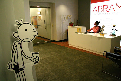
DIARY OF A WIMPY KID : DOG DAYS SUMMER READING COAST-TO-COAST ICE CREAM TRUCK TOUR Comes to NEW YORK!
David Macaulay's TED talk
http://www.ted.com/talks/david_macaulay_s_rome_antics.html
Among Macaulay's many awards is a Caldecott Medal for his book Black and White. He has produced an acclaimed 5 part PBS series (and companion book) Building Big, which reveals the engineering wonders of the biggest of the big. His classic work The Way Things Work (and its new edition, The New Way Things Work), was on the New York Times bestseller list for 50 weeks. He is an illustration instructor at his alma mater, the Rhode Island School of Design"
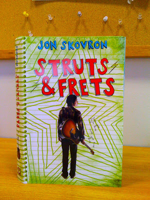
STRUTS and FRETS Finished books are in!
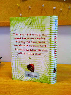
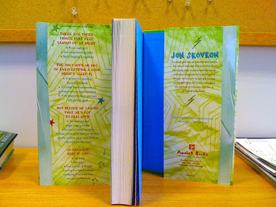
STRUTS & FRETS
http://strutsandfretsbook.com
THE MUSIC
http://strutsandfrets.jonnyskov.com/music.html
Are books dead?
www.youtube.com/qtv
"With the arrival of digital readers some in the book world are wondering if their industry will follow the music industry's lead of online content quickly becoming king over hard copy.
Chip Kidd weighs in on the subject. He's been called the "world's greatest book-jacket designer" and USA Today has labeled him "the closest thing to a rock star" in the world of book-cover design. Jian gets into Chip Kidd's craft as well. "
AMULET twitter background
Music Video Monday
NERDS! BOOKS ARE IN!
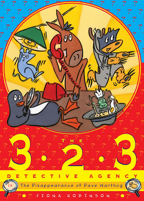
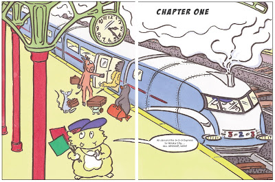
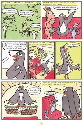
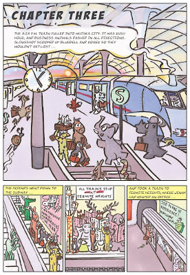
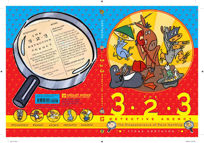
The Evolution of the 3-2-3 Detective Agency Cover
By Fiona Robinson
One of my favorite books on the Fall 2009 Amulet list is 3-2-3. I have talked about evolution Michael Buckley's NERDS in dept and will soon be posting about Lauren Myracles Luv Ya Bunches but right now its time to take a look at the evolution of the 3-2-3 cover design.
On the 3:23 Express to Whiska City, five unlikely friends meet and decide to form a detective agency. There is Jenny the wise donkey, Roger the gourmet dung beetle, Priscilla the theatrical penguin, Slingshot the hyperactive sloth, and Bluebell, the shy but brave rat. With little training but a lot of pluck, they set up shop in Whiska City and soon tackle their first mystery: a rash of disappearances linked to a pink poodle’s beauty salon.
A funny, clever detective story for young graphic novel fans!.
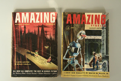 On one of Fiona's many enjoyable visits to our offices she dropped off these 2 pulp comics, AMAZING STORIES. Which I took some direct and indirect influence from. The trick was to introduce the characters in a pulp comic setting while remaining true to the Fiona's voice.
Here are three of our first attempts.
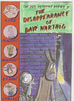
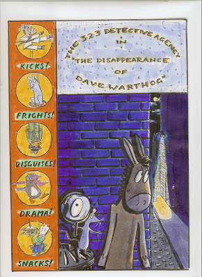 We all loved the humor an wit of Fiona's characters along the spine but how to make the type work was still and issue.
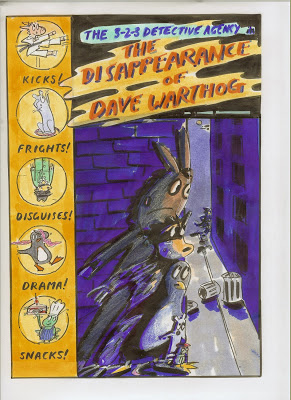
In all three of the above the title type was a problem. No matter what we tried the design forced us to put the copy in a box which just didn't seem to work. Also, it became repetitive to show all five characters along the spine and in the main image. There were to many parts, to many things going on. Below is an attempt at simplifying the above ideas.
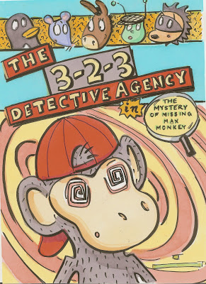
This direction seem to click at the time. We liked it enough to present it and the other ideas at our weekly cover meeting for discussion. The conversation in the meeting turned to a confusion over why the monkey was hypnotized and whether this was the image that was best for the book. We also talked about what was more important, introducing the characters or telling the audience that this is a pulp mystery graphic novel. At the moment we were displaying all these ideas yet nothing was working 100%. So we were sent back to the drawing board.
Almost a month went by before I was able to take another go at rethinking the design Luckily we were ahead on this book so I had time to waste. But more importantly time to step back and take another look from a far.
Knowing what we needed to be on the cover helped going forward.
1. Introduce the characters
2. Pulp comic design influence
3. Simple design/Iconic Image
4. Communicating that the book is a mystery.
5. Setting up a design for a possible series if needed.
On a rainy Thursday afternoon Fiona and I sat down in my dark office and I sketched this up while listening to Fiona's ideas.
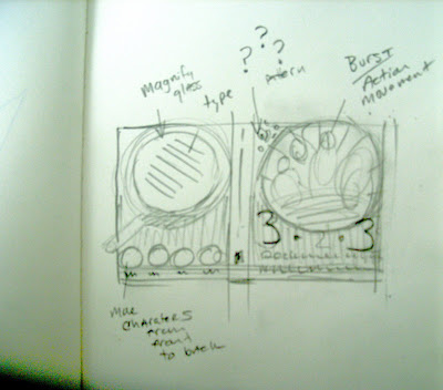
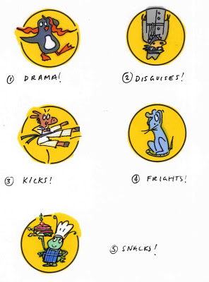
We wanted to somehow keep the circle character drawings from the first cover comps. Can any one say BACK COVER?!
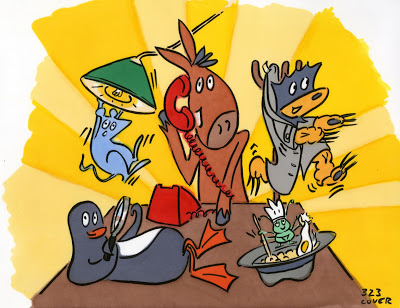
Fiona's Final cover art
Back cover hand drawn text
Paperback text
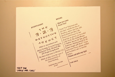 Back cover hand drawn text
Hardcover text
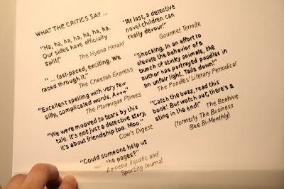

A needed graphic element hinting at a mystery and an important plot point.
 Final cover design.
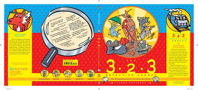
Paperback, and hardcover with jacket
SPECIFICATIONS FOR BOTH BOOKS:
80 pages, full color, 6 3⁄4 x 9 3⁄8"
PAPERBACK ISBN: 978-0-8109-7094-6
HARDCOVER ISBN: 978-0-8109-8489-9
US $9.95 CAN $12.95 PB
US $17.95 CAN $23.50 HC
Scenes from my Bulletin Board•Part 1

I thought it would be interesting to post a photo of my bulletin board in my office once a month to see what I am working on. I usually post up covers that I am designing or art directing to 'live with them' for a while an see if they are working. Some titles on my board are The Strange Case of Origami Yoda, Meanwhile, The Popularity Papers, Attack of the Fluffy Bunnies, Fizzy Whiz Kid, Sisters Grimm, Bear In the Air and Anxious Hearts. The beginning of every month I will be posting "Scenes from my Bulletin Board". I know . . . you're excited.
Follow me on TWITTER
WIMPY KID DOG DAYS: ICE CREAM TRUCK
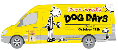
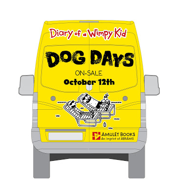 Designed by Jeff Kinney and Chad W. Beckerman— Our first Ice Cream truck design.
In keeping with the new book’s summertime setting, a custom “Wimpy Kid” ice cream truck will visit 40 U.S. libraries over the course of 30 days beginning August 3, promoting “The Dog Days of Summer Reading.” Beginning in Sacramento, Calif., the truck will wind its way through California, Nevada, Arizona, Kansas, Nebraska, Iowa, Illinois, Ohio, Pennsylvania, Washington, D.C., Virginia, Maryland, New Jersey, New York and Connecticut before ending its tour in Boston, Mass. Additional tour details are available at the Wimpy Kid Web site.—Publishers Weekly
WIMPY KID ICE CREAM TOUR TRUCK. IS IT COMING YOUR WAY?
Check the map.
Click Here.
The Big Reveal: The cover of DIARY OF A WIMPY KID: Dog Days
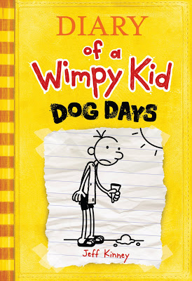
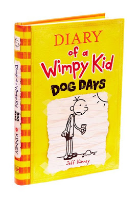
New York, NY, July 23, 2009—Amulet Books, an imprint of Abrams, reveals today the title, color, and cover of the fourth book in Jeff Kinney’s bestselling series with press outreach and a special online reveal available only on www.wimpykid.com.
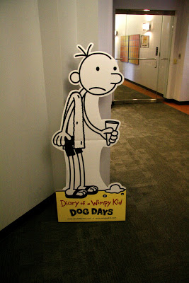
DIARY OF A WIMPY KID: DOG DAYS has a yellow cover, which follows the red, blue, and green of the first three bestselling books. It releases in a one-day national lay-down on Monday, October 12, and will have a first printing of 3 million copies. Following the astounding sales and publicity momentum of Diary of a Wimpy Kid: The Last Straw, one of the biggest book releases of 2009, Dog Days is poised to bring the Wimpy Kid series to new sales and media heights.
“I didn’t want my fans to have to wait a year for a new book,” said Jeff Kinney. “I’m very excited about Dog Days, because it takes Greg out of the school setting for the first time. It’s been a lot of fun to write about the Heffley summer vacation.”
To promote literacy and libraries alongside the release of the new book, a custom-designed and branded Diary of a Wimpy Kid ice cream truck will tour to over 40 libraries over a 30-day period to promote the “Dog Days of Summer Reading.” Starting in Sacramento, CA, on August 3 and concluding in Boston, MA, on August 29, the truck will deliver free ice cream to fans as it traverses the country. The tour will include a social media tie-in chronicling fan enthusiasm in each city, and offer Q&A broadcasts with Jeff Kinney at random stops along the route. The complete schedule is available through a link on www.wimpykid.com.—Jason Wells Publicity and Marketing Director ABRAMS
Behind the scenes_ Diary of a Wimpy Kid : Dog Days
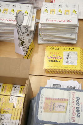
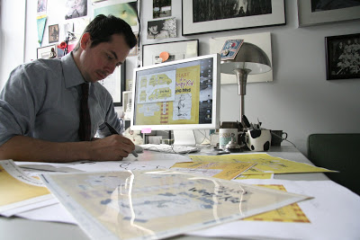
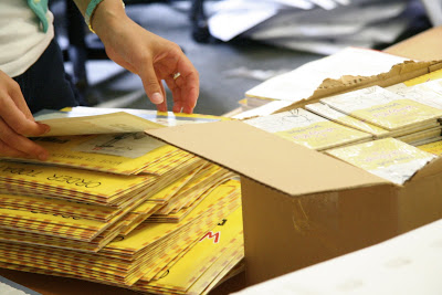
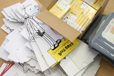


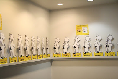
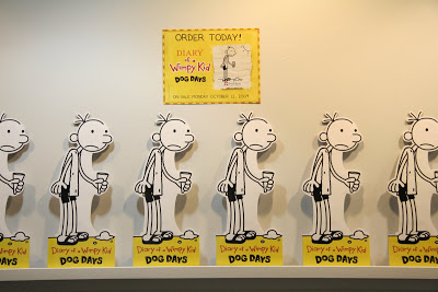

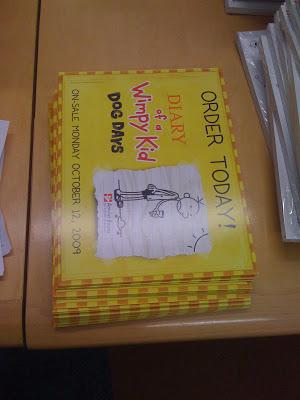
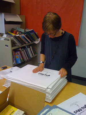


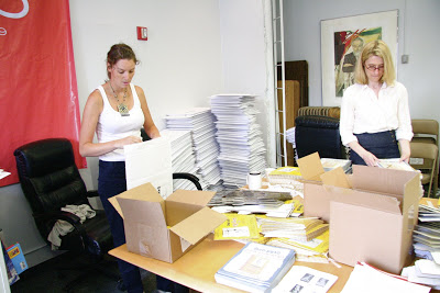
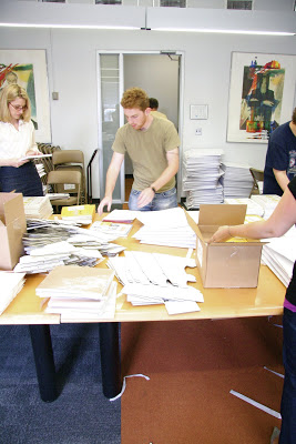
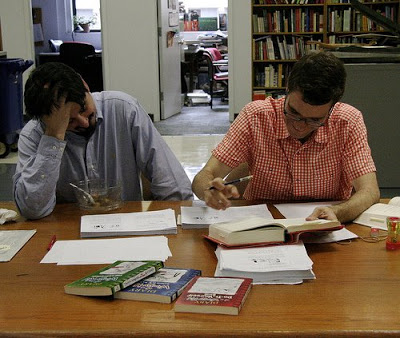
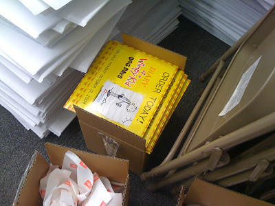
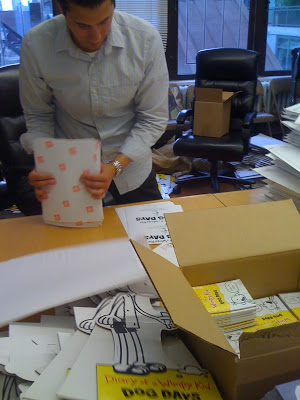
Jason Wells and his team prepare to ship out over 2000 Wimpy Kid : Dog Day kits to book sellers.
WIMPY 4 "The Big Reveal"

"The Big Reveal"
of the title, color, and cover of Diary of a Wimpy Kid 4.
Any guesses?


Behind the scenes—WIMPY KID 4

go over the final manuscript for
Diary of A Wimpy Kid 4
( Title to be announced soon)
ON-SALE TUESDAY OCTOBER 12, 2009

Asterios Polyp is David Mazzucchelli’s masterpiece

From The Pantheon website:
Meet Asterios Polyp: middle-aged, meagerly successful architect and teacher, aesthete and womanizer, whose life is wholly upended when his New York City apartment goes up in flames. In a tenacious daze, he leaves the city and relocates to a small town in the American heartland. But what is this “escape” really about?
As the story unfolds, moving between the present and the past, we begin to understand this confounding yet fascinating character, and how he’s gotten to where he is. And isn’t. And we meet Hana: a sweet, smart, first-generation Japanese American artist with whom he had made a blissful life. But now she’s gone. Did Asterios do something to drive her away? What has happened to her? Is she even alive? All the questions will be answered, eventually.
In the meantime, we are enthralled by Mazzucchelli’s extraordinarily imagined world of brilliantly conceived eccentrics, sharply observed social mores, and deftly depicted asides on everything from design theory to the nature of human perception.
Asterios Polyp is David Mazzucchelli’s masterpiece: a great American graphic novel.
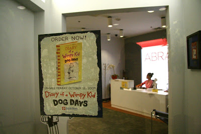
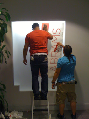
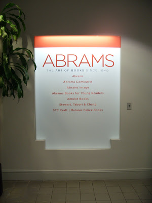
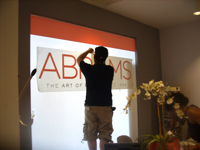
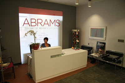
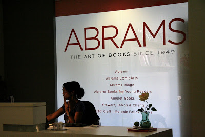
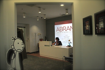
ABRAMS new lobby sign has arrived!
Behind the scenes of Dotty with Julia Denos and Erica Perl
Part 1
Here is the origin story on DOTTY by Erica Perl, author:
EP: When I was a kid, I had imaginary friends. I told my parents that two of them were twins but were not the same age (which they found funny, though I didn't understand why for years) and their names were Sahti and Dahti. I was probably about three or four at the time, which I know because we moved to Rhode Island when I was four and these memories predate the move. I also had an imaginary pet (a sheep) when we lived in Vermont, where we didn't move until I turned eight. But by then I was pretty sure that I'd get teased if anyone found out about my imaginary sheep, so I didn't tell anyone. I think the initial idea for DOTTY came out of both of these experiences: having an imaginary friend that interested and amused others, as was the case with Sahti and Dahti, and having an imaginary friend that might be a source of ridicule. And, of course, the name "Dotty" came from "Dahti."
On writing the manuscript:
EP: When I first wrote the story, I relied on this memory I have of overhearing a girl gossiping about me to a friend and the friend replying, "Who's Erica?" And then the first girl pointed me out by saying, "Hey, ERICA, I like your sweater." But when I went to storyboard out the book, I was surprised by the intensity of Ida's —and Dotty's —reaction. This sometimes happens when I write a piece… it is much neater in word form, but if I start sketching and drawing, ideas flow and things happen. It's why I always encourage writing students to draw, even if they don't want to be illustrators. Sometimes you don't know what you want to say with words until you get an image.
Erica Perl on the evolution of Dotty:
EP: When my draft of the manuscript was finished—long before Julia was selected as the illustrator—I started reading the story aloud as part of my author visit presentations. I'd ask the kids to raise their hands and tell me what kind of animal Dotty was. And the kids would tell me: she's a bull! she's a goat! she's a giant guinea pig! So I realized for the first time that maybe Dotty was an animal unto herself . . . or a one-of-a-kind combination of many kinds of animals.
On selecting Julia Denos:
CW: It was actually kind of hard. Erica Perl ( author) remembers talking with Susan Van Metre and telling her here ideas and hearing hers. We were on the same page, both of us wanting someone who could capture the whimsical qualities of the piece without making it overly sentimental or losing the humor and range of emotions. Julia Denos was my pick among other. On a rare occasion do i find and illustrator from a mailer. Yet this is how I cam across Julia. Erica recalls checking out her online portfolio (after I sent here Julia site to review ) and thinking "YES! Oh please let us get HER!"
FOLLOW Julia at here Blog http://www.thecinnamonrabbit.blogspot.com
You might remember Julia Denos's work from Tim McGraw's picture book My Little Girl.
So we begin. Julia and I worked out a time table for sketches and final art as well as other contractual items.
Here are Julia's first sketches
 Video Chatting over sketches.
Kay was Benny’s. She had razor-sharp teeth, but Benny swore she would never really hurt anyone. Beeku was tiny. She swung back and forth on Katya’s braids, chattering all day long.
And there was Dotty. Who kept mostly to herself, nibbling the rug. "
First round character and layout sketches
Ida Brunnette . . .

 and slow began to look more like a buffalo
 then more cow like
Other Imaginary friends


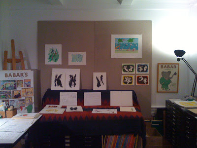
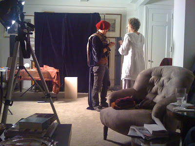
An evening with the de Brunhoffs
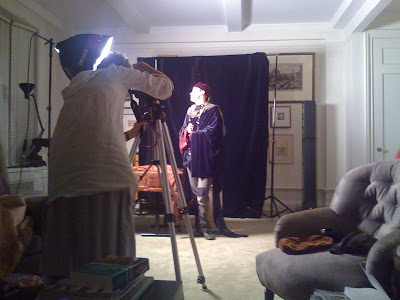
Laurent, my resident model, as he was and started throwing upholstery
fabrics onto him to try to make him look like someone else. About the
same time I went to the Frick and was, as always, blown away by the
Holbein portraits of Thomas More and of Cromwell. So I started
photographing men with the intention of reproducing some of the
effects of Holbein portraits, especially the lighting, the palette,
and the gravity of the sitters. I increased my stock of velvets and
damasks on West 38th Street and from fabricguru.com. And I bought
some hats and fur pieces and significant objects (astrolabe,
telescope, skull etc) on eBay. I like to let sitters choose an object
they want to be associated with. Over time, I've moved from Holbein
as a model and gotten more promiscuous in my inspiration. Titian,
Rembrandt, Bronzino, and Veronese are important, too. Conclusions? I
think men have very few opportunities to play. Also I think they look
better dressed in velvet robes and caps than in what they're
encouraged to wear these days. In case you're wondering,
I can't do women because their clothes are too complicated
and the jewelry has to be good.







 My
My 


